Showing posts with label 1 The Frame. Show all posts

Sunday, 22 April 2012

Assignment 1 Tutor feedback and response


The feedback on Assignment 1 and on my initial efforts in The Art of Photography have just been received from my tutor, and I am pleased with a very positive response to my approach to the exercises, the research around the subjects, the structure and content of the blog and the majority of the images submitted for assessment.  There are a few of the sixteen submitted images that I plan to re-shoot, two just requiring adjustments to the lighting to emphasise the quality of the contrast I was attempting to display with the subjects I chose, and one that needs a re-think.
The overall summary was:-

“You made a very good start to your start to your course.   Your photography is up to the expected standard at this stage of the course and you have dealt with this assignment very well. 
Your log is comprehensive and complete and impresses me with the full treatment you are giving your exercises because this is an important component in your learning experience.
My examination of your images and the other contents of your blog indicate that you have taken one of the most important steps to successfully completing this course which is to allocate sufficient time to general study, working on the exercises and consideration of the requirements of the assignments”.
Response to the contrast ‘straight’ was that the “ image interprets the contrast very well but I would draw your attention to the rather bald sky in which there is almost no tone at all”.  I totally agree with this and I’ve looked back at the image in Lightroom but there is nothing in the way of tone that can be extracted from the sky in the image as shot, but I will certainly be more aware of this in the future.
My tutor’s view of the ‘soft’ image was that “The success of the image of a powdered substance rests in its generally accepted reputation for softness.   Your image of the feathers could have succeeded if the colours were softer, say white and floating in the air rather than at rest.   Your image is dark and rather inexplicit for the task”.  I wondered about this at the time as I did not use the sweet/orange and sour/lemon images for my final submission because it relied entirely on the viewer knowing that oranges were sweet and lemons were sour and this could not be informed by the image alone.  I should have wondered some more and not used the powders maybe ..  The image is indeed dark and has been lightened as below. 

However, a little later I gave further consideration to this and decided to drop the powders for 'soft' and to shoot an image that was aligned with the ball theme I had used for 'hard'.  To this end I produced the following:


Interesting that the tutor comment mentioned the feather, because as it happens, my original efforts at ‘soft’ did involve dropping the feathers down in front of a white backdrop and photographing them as they fell, but I failed to get an image I was satisfied with.  However, I do plan to come back to this in the future.
The tutor view of ‘hard’ was that “In my opinion the cricket ball does look harder by virtue of its glossy surface.   If you restricted your choice to the salt crystals alone and lit it to pick up their reflective nature it could have succeeded better”.  The cricket ball does indeed look hard, especially as the light was catching the gloss of the wax, so this would have been a better option to offer as ‘hard’.  I have added this image to the portfolio to represent this contrast for my final submission..

The rough surface of the tree bark was seen as successful, but the wooden fish not so.   “The surface grain pattern on the fish is unsuccessful in giving the impression of smoothness (Although it may well feel smooth to the touch).  The strong surface pattern disguises its true qualities.  If you positioned your subject in relation to the light source to create a shine on its surface it could have achieved the effect you were looking for”.  I took some more pictures of the fish with the lighting specifically set to show the smoothness of the surface.  I did this by ensuring that the natural daylight was from the front of the fish and used a shallower depth of field (f/6.7) to throw the tail out of focus and emphasise the head where the shiny smoothness was apparent.  I also took more time to set up the shot and photographed it in such a way that it was nicely set up with a  white foamcore board some way behind to give a diffuse and featureless background to emphasise the fish.

My version of ‘high’ was the 310m high ‘Shard’ in London – can’t get much higher than that – and it was seen as a successful image.  ‘Low’ was a failure with the comment being  “I am afraid that the point of this image escapes me.   You took your first image from the ground; looking up to get the effect of height and a suitable contrast could have been obtained from a high viewpoint looking down using the perspective to give the impression of height.  Please do not take any unnecessary risks”.  I agree absolutely that ‘low’ missed the point and was an image that offered nothing.  I wanted to stay with the architectural theme and looked through some of the images I took at the London Eye where everything on the ground looks low!  My selection as a replacement image was an image of Westminster from the top of the Eye.

Added January 2013

I have spent nearly a year looking for an image to try and replicate the view of the Shard, except looking down instead of up.  I think I finally got close and will be replacing the above image with the following as my submission 'low'.  Shot at a very high ISO of 3200 and even then only getting 1/20sec shutter speed on a moving escalator, I managed to get some of the shapes of the Shard reflected in this image.


Now back to my original feedback response ....

Other image pairs not specifically mentioned were seen as successful from the perspective of Assignment 1.
My ‘high/low’ contrast pair was not very successful with the ‘low’.  I obviously need to work on my ‘lows’ or just find another contrast pair!!!  I will consider this over the next few days and submit a further image.

After some thought about what I was really trying to show here, I went for one of the images taken from the top of the London Eye which showed an empty capsule and some of the superstructure taken from the very top of the Eye (high!), and London down below (low!).

Monday, 9 April 2012

PART 1 : Final thoughts


Well, I’ve completed the exercises and non-assessed Assignment 1 in about 10 weeks, which in view of limited time and the length of some of the exercises themselves, I am very pleased with, especially as the first time round it inevitably takes time to set up the blog and establish a way of working to complete the exercises and consider what has been learnt from each. 

More pleasing in many ways is the amount of background reading I have completed (see the references list in the blog side bar) and the influence and inspiration I have gained from the events I have attended.  I am genuinely surprised at how much of a difference I have seen in my own photography and how I approach taking a picture, even with the subject types with which I am most familiar.  Additionally, I have found that I now take a much more considered approach to reading photographs and thinking about the relationship between their individual elements and also to how my eye moves around an image and how I feel about what I see.

Blogging has been a great way of recording progress through the course, although the vagaries of Blogger are irritating in the extreme.  I write everything in Word using Ariel 11 font before uploading, and Blogger’s habit of changing font size, adding in extra line spaces occasionally obliterating paragraphs which were clearly present is bloody annoying.  The hard copy Learning Journal has been a success and has enabled me to capture prints of some of the images I was not able to reproduce in the blog other than by linking to originals.  I have treated it as more of a scrap book and it has been good to be able to revisit pages and scribble in notes as thoughts have occurred to me.  My tutor has stated that he does not need this to be submitted for the first non-assessed assignment, but I will be sending it along on subsequent occasions as I believe that it adds significantly to the blog and has always been produced with the intention of the two being followed side by side.

The visit to the Taylor-Wessing portrait competition was a real eye opener - the first non-wildlife photography exhibition I have attended – and it was fascinating to see the differences between the highly contrived studio or location portraiture and the ad hoc images which were taken as a situation was found.  The latter category made more impact on me initially as it seemed more real, but upon a month’s reflection, I will confess to a growing interest in understanding and actually doing some studio based portrait photography myself.  To this end I have signed up to do a two day studio workshop run by the Royal Photographic Society, which I am sure will be of major benefit later in the OCA course.  This is run at Lacock in Wiltshire, conveniently close to the Fox Talbot Museum for a little inspiration.

The New Documentary Forms exhibition at the Tate Modern also made me think more widely about my own photography and especially in producing images that lead the eye around complex scenes – my own work is often of single discrete subjects, as is much wildlife imagery, and I have promised myself that I will make a serious effort throughout the course to consider options to have more content in images where there is potential to do that ….. which of course means thinking about how I want the eye to travel round the image and the message I want to convey.

Michael Freeman (2007) in The Photographer’s Eye covers many of the things I need to consider to make greater impact in my own photography, and his points around composition especially hit home and will be remembered in the future.  The other book which made particular sense was Chris Gomersall’s (2012) Wildlife Photographer – a Course in Creative Photography, especially his focus on taking images that are either narrative and create a sense of place, or abstract close ups to really generate interest in the viewer.  I have attended a number of the author’s workshops and will be doing so again in April by attending his Birds of the North Norfolk photo tour.  In addition to concentrating on portraits of the birds, I will be making a special effort to look more widely around the habitats and see what creativity I can come up with and how much better I can use the available light than I have done in the past.

Starting the OCA course has also widened the range of periodical photographic literature I have reviewed with the monthly Black and White Photography making me think far outside what I have done before, and I have experimented with some of my existing images to produce mono conversions in Lightroom 4.  I have processed several of my Contrasts assignment images in mono, and they were amongst my favourites of those I submitted.  I have downloaded a trial version of Nik software’s Silver EfexPro to check out as well, although I don’t plan to get too far into that at this stage other than to develop a general idea of how it compares with Lightroom 4 black and white conversions (far better by many accounts, but we’ll see).

As far as the OCA is concerned I have been a reasonably regular contributor to the student forums and have also signed up to attend the first ever weekend photography students conference in Leeds in September where it will be good to meet some of the tutors and other students from the course.  This is largely aimed at those further along the road to BA and beyond Level 1, but it will be a valuable insight into what is coming in the future.

So, all in all, a lot has happened since the Big Red Folder fell through the letterbox at the end of January.  A couple of thousand images I would never have taken before have been taken, books that would never have been read have been read, photographers I have never heard of have been studied, and there has been a total change in thought process and approach. Can’t be bad …… onward to Elements of Design!! 
I plan to complete Elements of Design by June 30th 2012.

Saturday, 7 April 2012

Exercise 06 : The Frame : Fitting the Frame to the Subject


The requirement here was to find a subject which was “clear in appearance and compact in shape” and to experiment with how much room in the frame it took up.  I chose to do this exercise with the London Eye.

The first shot needed to be just a photograph of the entire object without too much regard for composition (OCA’s words, not mine!!!).  This was a shot of the Eye from the north bank of the river which sets it in a general landscape of the river frontage.

The second shot was required to be fitted as tightly to the frame as possible, but without any of the subject escaping out of the frame.  Beingobviously round, the Eye can be fitted tightly to a 3:2 framing either top to bottom or side to side, but not both without cropping.  The following image is with the Eye tightly framed top to bottom as this then remained within the same frame shape as the other distance shots.  With a square crop, the structure could of course be fitted tightly to the frame in all orientations

The third image needed to be a close up of some part of the subject where none of the edges were visible and I went to the other bank of the river to get a close up shot of the spokes of the wheel and the structure which supports the hub of the Eye.

Lastly, the final shot was to be from a distance which allowed the subject to occupy a quarter of the frame or less and make a composition that stressed the environment around the subject.  I took a distance shot of the Eye from Westminster Bridge which really emphasised the location and showed both banks of the river, the next bridge downstream and some of the London skyline.

The final thing to do was to review this final image and evaluate the impact of crops that could be made from it.  Using the Lightroom 4 cropping tool I looked at a number of options and selected two that I felt worked well.  The first was a vertical crop placing the Eye to the right of the frame and including the steps and jetty by Westminster Bridge in the foreground, and the second was a letterbox crop showing the river with the Eye again set well to the right hand side.  I really like panoramic crops and felt that this one was the best of the images I have presented in this exercise as it offers such width to what is already a very broad scene looking downriver.


Wednesday, 4 April 2012

Exercise 13 : The Frame : Vertical and Horizontal


The objective here was to take 20 photographs in the vertical axis.  The recommendation of the course notes was to do this in a compact location to allow the same images to be easily re-shot in horizontal format later on.  I took several sequences of images from one of my visits to the Embankment area of London and some locally to my home and work.  In the case of the London images I took the vertical sequence, examined these on the camera, and then shot the horizontals – simply a practical approach and the need to be pragmatic to address the goals of the exercise within a sensible timeframe.  I also stuck with 3:2 and 2:3 image size ratios as I wanted to test this exercise with full frame shots rather than to do any cropping.  Where mentioned in the text images are tagged with number and title.  I have not discussed all 40 images.
The OCA notes suggest that there may well be a bias towards tall objects to fit into the vertical frame, but I did not find this to be the case in all instances, although there was tendency to place the ‘weight’ of the image low in the frame with the vertical shots compared to the horizontally framed pictures.   However, I did find that I also sought to include more foreground in some of the verticals in which case the main subject of the image was placed near the top of the frame.  In many cases I preferred the vertical composition as it introduced additional foreground elements which added interest to the image and gave better leading lines to the pictures.  This was especially true of the bridge arch at Carrbridge (V1, H1) and the Tower of London(V2, H2) pairs, but the Gherkin (V3, H3) and the City Hall (H4, V4) shots worked far better in horizontal framing as this created a more appealing balance and more interesting images – this is in alignment with my previous comments from the visit to the National Portrait Gallery and the New Documentary Forms exhibition where I observed that I need to include more visual elements in some of my images to add interest and give the viewer more than just the key subject to look at.

The vertical view of St Pauls from across the river (V5,H5) was certainly balanced with the weight at the bottom of the frame for the best effect, although the view of the cathedral from along the Millennium Bridge (V6, H6) was a more pleasing image with the focal point of St Pauls towards the top of the frame.

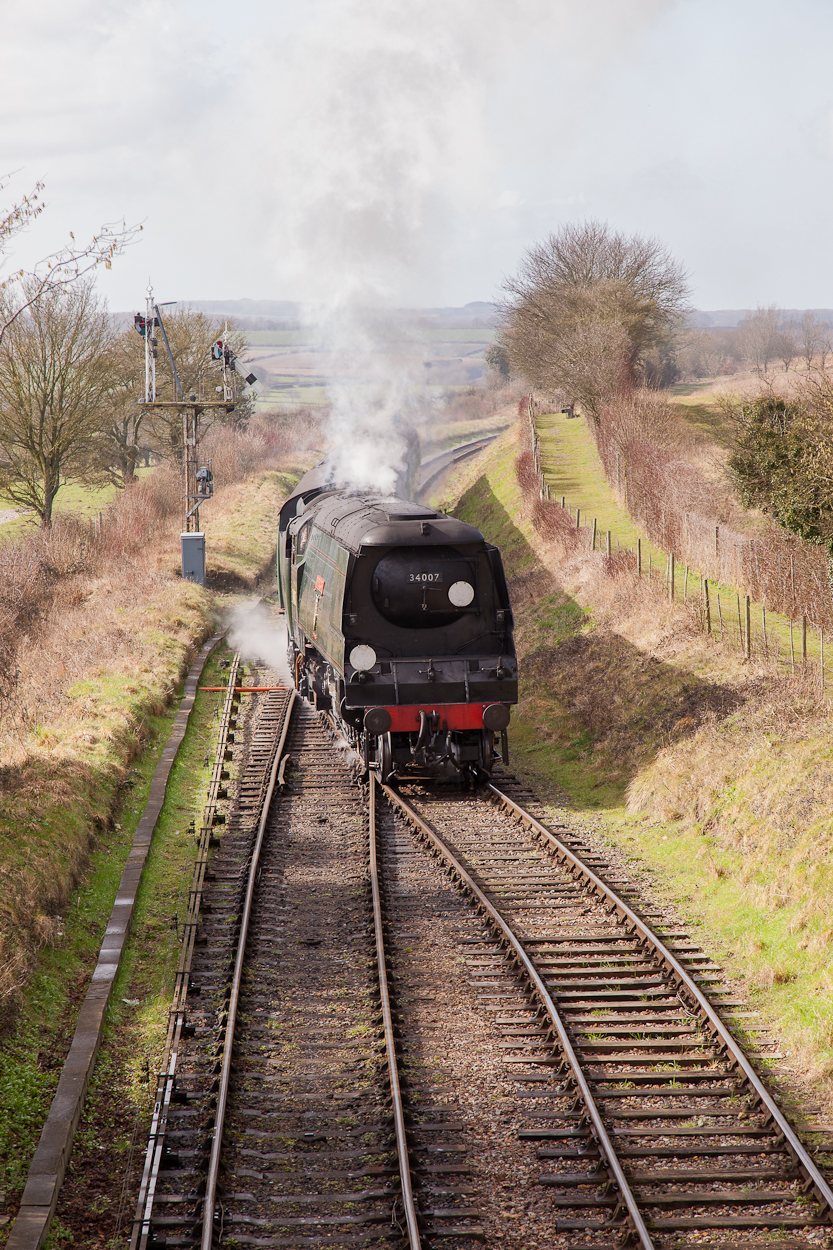
The pair showing thew wooden bridge (V7, H7) were probably the pair that generated the greatest change in perception between the vertical and horizontal frames, at least to my eye.  The vertical gave a lovely 'up and over' feeling and also a slight sense of mystery as to what might be at the other side.  The horizontal frame is still a pleasing image but lacks the symmetry and question of the vertical.  The vertical of the church (V8) is set well to the bottom of the frame but I think lacks the setting that is implied by the horizontal frame (H8).  The steam train (V9, H9) was a bit of a cheat in that it was not technically the same subject in that the two pictures were taken a few seconds apart as the train approached.  However, the vertical frame is a much more pleasing image in that it suits the length of the train better and also allows the plume of steam to rise vertically into more space than the horizontal frame.  I was pleased to have spotted the potential for this framing as I was not specifically thinking in terms of this exercise at the time, but thought that a vertical might be a more appropriate treatment.
The aim of the project is to demonstrate that framing is often just a matter of habit and that the vertical can be accommodated in most images with a little effort.  Interestingly, I take a fair proportion of my wildlife images in vertical format as it is reckoned that vertical outsell horizontal by around three to one – presumably because of the upright format of most magazines.  The outcome as far as the actual verticals was not as clear as I had expected, presumably because of my image and location choices.  I did not find that the balance of weight in the vertical frames fell to the bottom of the frame as often as I had expected it would.

I found this an interesting exercise, although I felt that 10 images in each orientation would have been enough - loading 40 images at the glacial speed that blogger loads at was never going to be a joyful experience.   I also learnt that it is a good practice to frame up both horizontal and vertical images when taking a shot and to photograph both orientations if possible – there is also the possibility of some imaginative cropping later on if both options have been covered.  I will certainly adopt this as a routine practice in future.

All images taken with a Canon 5DMkII with a 24-105mm L IS lens.
V1  Carrbridge

H1 Carrbridge
V2 Tower of London

H2 Tower of London
V3 Gherkin

H3 Gherkin

V4 City Hall

H4 City Hall

V5 St Pauls from the river

H5 St Pauls from the river

V6 St Pauls from the Millennium Bridge

H6 St Pauls from the Millennium Bridge
V7 Wooden bridge
H7 Wooden Bridge

V8 Church

H8 Church
V9 Steam train

H9 Steam train
V10 The Gate
H10 The Gate
V11 Hawthornedale House
V12 Hawthornedale House
V13 The Lane
H13 The Lane
V14 Lonesome Pine
H14 Lonesome Pine
V15 The River Bridge
H15 The River Bridge

Saturday, 31 March 2012

Exercise 8 : Sequence of Composition


The Girl in the Bubble

As I have said before, one of my target locations for photographing was the Embankment in London.  I found various street performers entertaining the evening crowds on a cold February evening and was particularly struck by these folks creating giant soap bubbles and the extraordinary interference patterns created by the setting sun in the bubble surfaces.  It was a challenging light as dusk approached and the light levels fluctuated as the sun dropped between the buildings along the river.  All images were taken with the Canon 5DMkII with the 24-105mm lens and f/4 and at ISO1600 or ISO3200 to give shutter speeds appropriate to keep the bubbles sharp.  The images look a little sludgey in these thumbnails, but look much cleaner in slideview.
I started off with a shot with the light behind me showing the performers and their initial audience.  My first thoughts were that there were too many people, too many distractions and the light was not right for the bubbles which failed to really stand out. At this point I decided that the key shot would be get the performers or watchers actually pictured through the bubble films themselves and set about getting into the right position to achieve coincidence of people, light, background and sunset.  I also wanted to capture the bubble lifetimes from beginning to end ...  Overall, I realised from the outset that was an ambitious attempt, but it was likely to be a one off opportunity, so worth the effort.


The next shot zoomed closer to the action to give the bubbles more impact and also went slightly to my left to get the bubble away from the tree in the background.


For the next image I moved right round the performers to shoot back into the light and start to focus in on getting people images through the bubbles.  The light on the bubbles was better but the background was a mistake with the overpowering influence of the lamp post and tree detracting from the photograph, so time to move round ..

An improvement, but the move to the right to get the tree further left, plus a step closer, did not significantly improve the image I didn’t think ..


Further to the right and I’ve got rid of the tree, but the sunlight flared over the buildings which gave a great boost to the interference pattern colours in the bubbles .


I felt that I needed to get closer for the next picture and started to home in on the performers themselves; the capture of the bubble bursting was a happy fluke!
A move round to the right and back a little for the next shot, and I went for the vertical to add Big Ben to the image and give the show some context and location.  
The following shot closed in again and just focused on the girl – it was also the first one where I managed to get a decent picture of the performer actually through the bubble with no other distractions.
The next photograph was my favourite of the sequence.  The bubble was huge and a beautiful shape, just catching the rays of the setting sun.  What makes it for me is the look on the girls face and her eye line. 


The bubble blowers were beginning to get some attention from other photographers and I moved much further to the left to get them in the frame.
Zoomed in on the next bubble to get the photographers behind it ..

Three people and three bubbles in the next picture, achieved by stepping back again, but lacking the impact of the tighter framing; I liked the three bubbles in a sequence though.
The final photograph focused on what I felt was the most compelling image of the series – just a single isolated bubble with a lovely reflection of the embankment and trees in the surface film along with the interference patterns.
I did actually have one more photograph, which showed the demise of the bubble as it hit the ground; I was very lucky to capture the moment at which only half the bubble was still visible.
I found this exercise a considerable challenge and made several false starts before I got something I was happy with.  I should have taken more shots early in the sequence (probably two or three more) to give something intermediate between the distant shot of the crowd and the where I started to home in on the performers and the bubbles, but there were no further opportunities given that it was nearly dark throughout the shoot anyway!  The location on the Embankment was a reasonable spot, but limited in that it was not possible to get to the other side of the performers to shoot with the light behind (the Thames was in the way ...) and there was quite a crowd that it was difficult to work round to change position quickly.  Overall, I was pleased with the outcome and I felt I learnt a lot from it in terms of positioning, the need to move, zoom or both, the impact of radical changes in lighting and the need to deal with mobile performers and random passers by.  I was pleased that I spotted the possibilities of getting reflections in the bubbles as well the more obvious interference patterns.
I plan to repeat this exercise in a situation where there are more people and will blog what happens after I attend a couple of agricultural shows in the near future, although that is likely to be after I have completed this part of the course.  I don’t feel all that happy about photographing people, although these street performers were obviously willing to be photographed by various tourists and students doing OCA courses and they were collecting anyway!