Showing posts with label Galleries and workshops attended. Show all posts

Sunday, 13 January 2013

Study visit. Henri Cartier-Bresson: a question of colour


'You'd have to be dead not to feed off the energy contained within this exhibition'

Alastair Sooke, The Daily Telegraph


The first study visit of the new year and the chance to join folks from the newly formed Thames Valley regional group of OCA photographers at the Cartier-Bresson :  A question of colour exhibition at Somerset House in London.  This is a multi-function venue, plus ice rink, which provides gallery space for various art shows and had dedicated four rooms to this exhibition.  The objective was to showcase ten HC-B photographs which had never been exhibited in the UK before alongside seventy five images from fourteen internationally recognised artists who worked in colour, eschewed by HC-B himself apparently on the grounds of its technical (at the time) and aesthetic limitations, but followed his ethos of capturing the ”decisive moment”.   I felt that there was some very wide interpretation of this in many of the pictures shown and there was to me sometimes the lack of a ‘decisive’ element.

Exhibition curator William E Ewing encapsulated the reason for the exhibition perfectly when he said "My proposition is simple: take the ethos of the decisive moment, and look at how colour photographers have actually fared. Put differently, if we take Cartier-Bresson's scepticism about colour photography as a challenge, how convincing is the response?"  HC-B is pitted against overwhelming numerical odds as well as having pictures shown that are drawn from lesser known examples of his work, and his relatively small images are pitched against the likes of the often far larger and imposing works of Boris Savelev, described in The Times as having a ‘cruel grace’, and the very loud work of Robert Walker to name but two.  A great deal of what is shown from all artists would fall into the category of street photography of one sort or another and I felt that HC-B’s images were often quite calm and contemplative, certainly compared to the action of Joel Meyerowitz.  Some of the work displayed was from photographers of similar age to HC-B, and Helen Levitt, Ernst Haas (whose wonderful vibrant colours I have blogged on before), Saul Leiter and Fred Hertzog were amongst these.  Hertzog was not a photographer I have come across before and I loved the beautifully composition and muted colours in images of his native Vancouver in True Story 1959, especially Old Man Main where the sharp, dense shadows fall contrastingly across the faded paintwork.  Saul Leiter’s street scenes often made use of reflections and images distorted by refraction through glass, with snow or rain further scrambling the image detail, although a photograph of a girl in a café (Paris 1959) made me think most of parallels with HC-B as it seemed quite a contemplative shot.

Boris Savelev had some imposing images which were printed on gesso coated aluminium and gave an almost lustrous but flat effect with very deep shadow which I thought suited the images of Moscow on show.  Interestingly, the images of Dog Moscow, 2007 I have found on the web seem far, far brighter than my recollection of the picture in the gallery, although it was done no favours by its particular hanging location as far as incident light was concerned.  From Joel Meyerowitz’s Intersections came Camel Coats 5th Avenue which is just brilliant with two couples walking away into the steam, with the shadows of people further behind falling perfectly on the backs of one of the couples – that one certainly was a decisive moment… 

The images most similar to HC-B I thought were those of Helen Levitt.  Levitt was a New Yorker, born in 1913, and therefore of a similar generation to HC-B, so maybe it was not surprising that she produced photographs of the city with a similar feel to them, at least to me.  Cat next to red car, New York, 1973 shared many of HC-B’s great compositional balance and interest around the frame.  Girl in a window, 1972 was a stunning image with the way the bars in the window separate the girl’s eyes from the rest of the face and the reflection in the glass of the buildings opposite add to the feeling of the girl somehow being locked in, although I have no idea whether this was the case.  Looking after the exhibition at some of Levitt’s early black and white work there were even greater parallels with HC-B’s photographs and interestingly they have been exhibited side by side in New York recently.

A final artist I’ll comment on is Australian Trent Parke.  Parke’s street work shown was from 2006 and examples such as George Street OJ and Today cold water, George Street, Sydney were wonderful mixtures of bright colour and intense shade, but with the figures picked out beautifully in the patches of sunlight.  They were very vibrant images, both in terms of their colour saturation and use of shadows and in terms of the movement of the people going about their lives.

So, overall, did HC-B meet the challenge, if indeed that is what it was meant to be, of the colour workers?  In my view he certainly did and stood alongside the more numerous colour artists by virtue of his superb compositional skills and balance in the images, although I would have been fascinated to be able to make the comparison between all the artists with a set of black and white prints of the same size from each …

Wednesday, 21 November 2012

Lighting studio portraits - the pro way ..

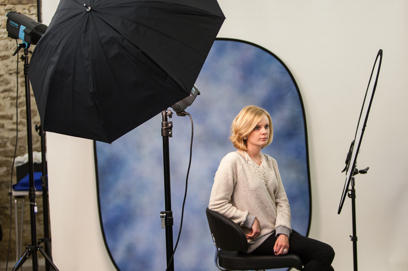
As part of my developing interest and understanding of light, I have recently been on a two day studio portrait photography workshop booked through the Royal Photographic Society and tutored by Chris Burfoot.  I have mentioned in a number of posts before that the Light module was the first time that I have really made any great effort to take photographs inside and get a grip of the lighting requirements to do so effectively, so this seemed an ideal opportunity to get some tuition in the area of portraiture and also to try out some top end professional kit instead of my pieces of silver foil, cardboard reflectors and tracing paper…..  The kit used throughout was Broncolor flash, which is as good as it gets, Lastolite reflectors, and a Hasselblad camera was available to borrow to see just what image quality can really look like (I thought my 5DMkII was good, but the H40D produces images from another world).

The course is based on flash and the pro studio units generate lighting like the surface of the sun compared to my two constant lights or Canon Speedlites.  The two days were so good because they generally covered the same aspects of lighting as are in the OCA light module and there was some commonality in approach as form, shape, colour and texture were emphasised throughout.  We started off with a simple single light setup, then introduced a reflector, then two lights, hair lights etc. and covered the lighting options as listed below.  We also worked with coloured, black and white backgrounds.
Cameras were used exclusively in manual mode and exposures set by use of flashmeter readings and adjusted with the controls on the flash heads, and of course I have to mention the endless patience of the model who smiled and posed for hours over the weekend.  One of the most valuable lessons for me was in the placement of reflectors and I was surprised how close these actually were to the model.  Given the massive light output of the flashes the reflector panels were often only 30cm or so from the model’s face, and that surprised me, but the panels are huge and made for a wonderful large source and therefore soft lighting, ideal for portraiture.

Front light + reflector + hair light with snoot + blue background
Taken with the above set up
Front lighting + reflector just under the hand
Front light high and pointing right down + triple reflector just below frame.  You can see the multiple catchlights in the eyes

There was a lot of other information discussed around the business of portrait photography and I picked up some websites to see how the pros do it.  So if you want to hire a fully serviced studio big enough to photograph a double decker bus have a look at BigSky London, and to see some amazing top end work that’s a bit different, try Ben McDade and Tim Flach.
  • Flash or Continuous light - advantages and disadvantages.
  • How a studio flash works.
  • Setting up a portrait with a single light.
  • Changing the quality of the light with simple accessories.
  • Placing the main light. Using a simple reflector.
  • Using a flash meter and setting your camera.
  • Adding a second light.
  • Light control accessories.
  • Hair/background lights.
  • Getting more depth into your portraits.
  • Using a main and fill light.
  • Balancing light sources with a flashmeter.
  • Lighting a white background - not lighting a black one!
  • Softboxes - stunning portraits with a small softbox.
  • Positioning lights and subjects.
  • The inverse square law

  • Using larger softboxes to create lovely soft lighting.
  • Hard, high contrast lighting. Mixing hard and soft light together.
  • Lighting for full length. The white background, for children and contemporary portraiture.
  • Camera viewpoint.
  • Using a lightbank as a huge soft light.

Friday, 9 November 2012

Brighton Photo Biennial 2012 Study Visit


Agents of Change: Photography and the Politics of Space
All Images posted are used with the kind permission of Photoworks and Brighton Photo Biennial 2012; please do not copy them from here.

The BrightonPhoto Biennial 2012 was curated by the journal Photoworks and included a wide spectrum of photographic art from established and emerging artists exhibited at a range of different venues across the town.  On the day I visited I managed to see work by Corinne Silva, Jason Larkin and Omer Fast and as well as a range of other collaborative offerings.  BPB12 aspired to “look at how space is constructed, controlled and contested, how photography is implicated in these processes and the tensions and possibilities this dialogue involves.”  It also claims that it “provides a critical space to think about relationships between the political occupation of physical sites and the production and dissemination of images.”  This was the first time I have attended such a multi-venue event and I thought that the dispersion of the exhibitions and the opportunity to get a breather between each session greatly added to the experience compared with the room to room progression of a visit to a single large gallery.

I attended this OCA study visit along with 26 other students and tutors Gareth Dent, Jose Navarro, Sharon Boothroyd and Clive White.  I was only free to stay for the Saturday, a day of gallery visits, and unfortunately missed the Sunday student’s portfolio review session which would have been great to attend.  I am relatively new to visiting galleries with the intention of actually thinking specifically about the images and how they make me feel rather than just viewing and appreciating the aesthetic qualities of what I’m looking at, and again I was struck by the absolutely vital importance and role of the image title and the synopsis in the exhibition notes and guides.  Without titles to steer thought processes, many images have little impact as there are no signposts to navigate the viewer in the direction the photographer intended, and without the notes there is often little context for the visual experience.  I think it is surprising how often I see photographs that would leave the viewer in doubt as to their content and intent without some words to point the way ..

The first session of the day was at the University of Brighton and was ‘Uneven Development’ by Jason Larkin and Corinne Silva, both covering the effect of urbanisation on the environment.  Silva focusses on the ‘meeting’ of Africa and Europe in Southern Spain and in ‘Badlands’ juxtaposes the contrast between the illegal African migrant workers and the villas and leisure developments for the rich that they are building. She considers the impact of the vast amounts of plastic sheeting that abounds in the area with the high end architecture and rapid development of the leisure trade as it spills across the landscape.  Although much of the plastic in the area, which is generated by the building and horticultural industries, is recycled, an enormous amount finds its way into the sea to be washed up along the coastline.  Corinne Silva contrasted two images of either black or white plastic which were displayed as a diptych in a vertical pair and contrasted with a pair of images showing the black and white plastic utilised in the building of rough shacks for the workers, in stark contrast to the dwellings they were constructing.
Copyright Corinne Silva.  Plastic mountain I.  Used with kind permission of BPB12 and Photoworks

I thought this was an interesting comparison of the rich and poor and how each has an environmental impact of its own, albeit of very different natures.  Her other offering, ‘Imported Landscapes’, apparently clashes global south and north by pasting Moroccan landscapes onto Spanish billboards but it was not something that resonated with me, and the claim to “consider their on-going trade, mobility and colonisation”  struck no meaningful chord at all.  I really see nothing of appeal in mashing together images like this and it left the same sort of impression, or lack of it, that I felt with John Stezaker’s efforts that I have posted about before.  It is possible that I am missing some fundamental artistic point here, perhaps I’m being too much of a photo purist, but these combination works and mixtures of found and photographed subject really leave me cold.
Copyright Corinne Silva: from Imported Landscapes.  Used with kind permission of BPB12 and Photoworks
 
Jason Larkin produced what I felt was a far more accessible work in his images portraying the building of gated communities for the rich and the workers who labour to construct them.  The photograph below from ‘Cairo Divided’ showed a large number of similar dwellings under construction and it was some time before I noticed the small figure of the worker placed in the centre.  I think this was true for a number of us, and having discovered the figure, it did much to put the image in context.

Copyright Jason Larkin: from Cairo Divided.  Used with kind permission of BPB12 and Photoworks

The other exhibition at the UoB was in marked contrast to Silva and Larkin and was Omer Fast’s ‘Five Thousand Feet is Best’, on Vimeo here, a reference to the best height to shoot from when using an unmanned military drone operated from the US and attacking targets in Afghanistan and Pakistan.  This was a strange offering which flipped between sequences from drone footage, a disguised drone operator, and staged events on the ground which offered several alternative takes on developments.  This left me rather unmoved, although the ending was dramatic as the apparently real drone strike images were cut with the actors and their seeming escape on foot from the scene.  From a personal perspective this was several steps too far away from photography, although I would concede that the drama and intensity of the short film was worth standing in the dark for.

Copyright Omer Fast: from 5000 feet is best.  Used with kind permission of BPB12 and Photoworks
A brief lunch in small groups was followed by a short walk around Brighton to catch a couple of the other exhibits, and including an outbreak amongst the students of picture taking of one another, we managed to look at Whose Streets’, a selection of photos from The Argus Brighton newspaper looking at the history and politics of contested space in the town over forty years of sit ins, marches, protests and demonstrations.   The selected images certainly made their point and encapsulated the emotions of the times, although mostly they were quite relaxed compared to many events taking place in the capital at around the same time.  There was certainly historical interest here and the photojournalistic approach was very much just to show scenes that reflected peaceful demonstration.

Map ... gps ... iPhone ... where are we again ...?
Copyright The Argus Archives: From Whose Streets?  Used with kind permission of BPB12 and Photoworks
Copyright The Argus Archives:  From Whose Streets?  Used with kind permission of BPB12 and Photoworks

The highlight of the day for me was the final trip of the session to Fabrica, a gallery housed in an old church which seemed much in its original state, and which provided a splendid setting for viewing images I thought.  The Beautiful Horizon: No Olho da Rua (In the eye of the street) was from a seventeen year collaboration between Brazilian street kids of Belo Horizonte and artists Julian Germain, Patricia Azevedo and Murilo Goday.  The kids had been given cameras to go and document their lives in any way they wished, and the photographers edited, published and distributed the resultant images.   Many thousands of photographs have recorded changes in the lives of the participants over a period of massive economic expansion in Brazil and have allowed the ‘socially and economically excluded’ to have a voice.  The impression I took from the photographs on display was one of mostly happy kids wanting to show off what they saw as the best elements of their lives, although there must be many dismal aspects to a life of grinding poverty (see later).  I have seen some of the areas of Sao Paulo where similar images could be taken and the smiling faces are there, mostly when there is a camera and the possibility of a few rials for posing, but in close proximity to crime, drugs, violence and prostitution.  I had an interesting conversation with Jose Navarro at this exhibition around how I felt when viewing the images.  I actually feel quite relaxed about what I was looking at as although I know the kids were sometimes showing happiness and the best parts of their lives, they had made a conscious choice to do this, as apparently no guidance was given to them.  There were some shots showing the paraphernalia of drug use and some subjects in various stages of undress and squalor, but largely I thought they had used their opportunity to look quite optimistically and expressively at their situation.  Now this was my impression and feeling from looking at the exhibition in the gallery, but when I got round to looking at the article in Photoworks, I was really surprised to see that the images selected there were almost exclusively of the squalid and sordid side of existence.  In the Photoworks selection, there is not one single smile … it has impact yes, but it certainly did not seem to reflect the totality of the photographs taken.

The artists claim that their work “deals with the politics of identity and visibility, self-expression and power” although rather depressingly also says that the kids have almost no sense of future, although in the short term the project has let them see that at least someone cares about what they do.  I thought the exhibition was emotionally very powerful and the environment of the old church in some way enhanced that experience.
The Beautiful Horizon: No Ohlo da Rua gallery space
The Beautiful Horizon: No Ohla da Rua gallery exhibition
Copyright The Beautiful Horizon: No Ohla da Rua.  Used with kind permission of BPB12 and Photoworks

My overall impression of the BPB2012 was that it was an excellent event with a huge amount to see which could never have been covered in a day, which was actually my original plan before the OCA study visit was announced, so I’m glad I never got the opportunity to attempt it!  The choice of galleries for the Saturday visit were good ones and the additional exhibitions we fitted in over lunch added significantly to the quality of the day.  The only other exhibition I would particularly like to have seen, and I was too late to catch it before it closed as I headed for home, was Bradley Garrett’s ‘Urban Exploration’ which is a series of photographs taken by intrepid folks around the world after they have infiltrated forbidden spaces such as building sites and underground tunnels where public access is prevented and the space controlled.  The images from the top of The Shard in London Bridge Quarter are astonishing and were taken by evading security and ascending almost to the top of the structure as it then stood.  There is an interview with Garrett (called Capital Striation) in the BPB12 edition of Photoworks and he focusses on the point that so much urban redevelopment is dedicated to facilitating the flow of funds and finance and how nothing can be allowed to stand in its path, so the jarring discontinuity caused by the clandestine exploits of these urban explorers cause waves.  It is well worth a read as his commitment to purpose really comes through as does his insistence that we all have the right to explore public infrastructure funded by our taxes. 

Overall, a great day out in the company of other students and tutors, and one which gave me a lot to think about in how I consider photographs and try and interpret the artistic intent.  It is an infrequent occurrence that I get the opportunity to discuss the courses and the views of others apart from in the online forums, and there is always a lot to be learned from the direct contact these days provide in addition to the more direct benefits of the exhibitions themselves.

Friday, 2 November 2012

2012 Wildlife Photographer of the Year Exhibition


The Veolia Environnement Wildlife Photographer of the Year is owned by the Natural History Museum and BBC Worldwide.  The images from the competition shown in this blog are reproduced by kind permission of these organisations, so please do not copy them from here.


It hardly seems long since I wrote one of my first ever blog posts for my OCA course after I attended the 2011 World Wildlife Photographer of the Year exhibition at the Natural History Museum in February this year, but already the 2012 competition has been judged and the winners are again on show at the museum.  There are 48,000 entries for the competition, including a couple from me (not winners!), and it is regarded as the premier wildlife photography event.  It never ceases to amaze me the lengths to which some photographers have gone to obtain their images and the amount of work that is needed to capture the rarest moments, although the competition offers categories for urban wildlife and various others that give all of us a chance without plunging to the depths of the Arctic Ocean or wherever!  The technical standards achieved throughout are remarkable and it represents the pinnacle of what is attainable, with the bar getting higher every year.

The 2012 winner was Paul Nicklen’s Bubble-jetting emperors and shows emperor penguins in the Ross Sea in Antarctica surging to the surface from beneath the ice as they rush for safety.  I think this is a very complex image that takes some time to digest and work your way around; there is so much going on with birds near and far appearing in the image as different sizes – I think that for me is what makes this image so compelling as the eye tries to make sense of the perspective and work out over what distance it is actually looking.  The clarity of the water and intense blue of the ocean, coupled with the bubble trails, make it a remarkable setting and the yellow colour accents of the feathers behind the eye really demand attention.
Paul Nicklen / Veolia Environnement Wildlife Photographer of the Year 2012
Nicklen also won the Birds/Behaviour category with Frozen Moment, again working with the emperors and their attempts to get back to the ice and escape the leopard seals lurking below.  I actually preferred this photograph to Bubble-jetting emperors for its closeness, focus on a single intimate moment in time and the great technical achievement to capture the image in the first place.  The bird which is exiting the water is frozen in mid air by the shutter speed, as are the water droplets, and its framing aginst the distant ice cliff adds to the impact of the image.
Paul Nicklen / Veolia Environnement Wildlife Photographer of the Year 2012
Another image on the flying theme was Ofer Levy’s Fly-by drinking of a grey-headed flying fox skimming the water surface to drink.  I have tried this shot with swallows taking insects hatching from a lake surface and it was a remarkable achievement to nail this one – getting a bat with its tongue sticking out was the icing on the cake!
Ofer Levy / Veolia Environnement Wildlife Photographer of the Year 2012
Anna Henly’s Ice matters speaks volumes for the potential fate of polar bears as the arctic sea ice recedes each year and the life of these creatures is held ever more in the balance.  This was a really symbolic image in that the fragmented ice floes almost seem to represent what is fast becoming a marginal existence for the polar bears and in a way allude to how their world is becoming more and more fractured and uncertain.  The use of the fisheye lens seems to add to the frailty of the bear placing it as it does in the middle of the vast expanse of shattered ice.


Anna Henly / Veolia Environnement Wildlife Photographer of the Year 2012
There were, as always, many absolutely stunning images in the exhibition, and one of my favourites was Luciano Candisani’s Into the mouth of the caiman as the creature waits for fish to come within reach.  The intensity of the lighting was what attracted me to this image as well as the murkiness of the water hiding much of the scene and consequently maintaining focus exclusively on the business end of the animal.  Finally, Practice run from Grégoire Bouguereau depicts a group of cheetah cubs watching a Thomson’s gazelle calf running away .. but all is not what it seems.  Events as told by the photographer related that the mother of the cubs had actually caught the gazelle, but had not killed it, and released it for the cubs to practice their hunting skills.  The gazelle is in sharp focus running towards the camera and is perfectly set off against the four cubs which are beyond the depth of field, although this does not detract from the intensity of their gaze.  The triangular shape of the players in the scene with the apex heading towards the camera engages the viewer in the action and it is an even more impressive image seen 'live'.
Although there are categories in WPOTY for various forms of portraiture, the most stunning and popular photographs are invariably ones that show dynamic action with lots of movement and energy to capture the imagination of the viewer.  There are a couple of truisms in wildlife photography and both allude to the capture of the decisive moment in the narrative of whatever the photographer is seeking to capture.  Firstly, if all you can think of as a caption as you press the shutter is just the name of the animal, don’t bother, and secondly that to get winning wildlife images you need to photograph the 3 Fs .. that’s feeding, fighting and … I can’t quite recall the third .. !
Luciano Candesani / Veolia Environnement Wildlife Photographer of the Year 2012
Gregoire Bouguereau/ Veolia Environnement Wildlife Photographer of the Year 2012


Monday, 22 October 2012

OCA Study visit to Prix Pictet Exhibition at the Saatchi Gallery


The Prix Pictet competition was established by the Swiss bank Pictet and Cie in 2008 and in each of the four years has had a different theme.  Previously, these have been Water, Earth and Growth, and now in 2012 the theme is Power, claimed by the exhibition website to have “great creative reach” and to … “embrace contradiction and paradox in equal measures.  The same forces that result in disaster and despair can also generate hope and renewal”.  The Prix Pictet claims to reach an audience of 400 million and uncovers “outstanding photography applied to confront the most pressing social and environmental challenges of today”.  Twenty one of us from various stages of the OCA Photography degree course met to view and discuss the photographs on show, and we were aided in our deliberations by OCA tutors Clive White, Gareth Dent, Sharon Boothroyd and Robert Bloomfield .  There were twelve artists selected for the short list and whose work appeared in the exhibition.


One of the clearest things that emerged for me was that sometimes the images offered by an artist clearly formed part of a sequence or narrative, whereas others stood as a number of individual pictures without connection other than their perceived association with the Power theme.  The prize winner was Luc Delahaye with Various Works : 2008 – 2011, and he has been one of my favourite photographers for some time;  I was asked by one of the tutors why this should be, and although I found this difficult to answer, I think it is to do with the questions that his images ask.  What was there before the image was taken, at what time after the event portrayed did he actually press the shutter, and was any degree of ‘staging’ used to empower the message?  Delahaye claims to be an artist rather than photographer and indeed the line between his photojournalism and art is often obscure, at least to me.  We discussed Ambush, Ramadi for some time; was the dust the result of the explosion or was it just blowing at the time, with the ambush having taken place sometime before?  The tyre tracks lead away from the scene and much debris has fallen over them indicating that they were made before the ambush.  For me, it is a remarkable image with its universal monotone, destruction, lack of any obvious life and the whole scene enveloped in a thick dust cloud that maybe hides some of the answers -  these were all aspects that really struck me with the gallery image at full size and which had escaped me entirely when I first saw it on the website. 

Ambush, Ramadi.  Copyright Luc Delahaye.  Used with kind permission of Prix Pictet and the Saatchi Gallery
This was actually a recurrent theme when comparing between the impact of various photographs in their screen size and gallery size;  in some instances I thought that there was little difference in how I felt when seeing the ‘life sized’ pictures in the gallery and how I felt when I reviewed them earlier on screen.  This was certainly true of Robert Adams Turning Back, which along with Arab Domains from Jacqueline Hassink, had little impact on me however I looked at them.  Hassink’s work looked at the interiors of houses owned by powerful female Arab business leaders and failed to affect me at any level; looking at dining rooms of varying degrees of opulence had no appeal.  However, Charlotte Cotton has an opposing view and has said that the photographs “ .. have a seemingly effortless simplicity to them ..” and that they “… carefully position the viewer as an observer onto each scene”.   It didn’t work for me.

From Arab Domains.  Copyright Jacqueline Hassink.  Used with kind permission of Prix Pictet and the Saatchi Gallery
I also mention Robert Adams as an artist whose photographs failed to connect with me at any emotional level.  They were the smallest of the pictures on show, thus making a significant visual contrast with the epic images of Delahaye and others, and appeared to be deliberately hung in a pattern as if clinging together for support.  The images featured various stages of deforestation and the stripping of tracts of woodland to expose the bare earth, but I felt they went no further than this.  I was surprised to read a couple of weeks ago that Sean O’Hagan in the Guardian wrote that Adams was his choice to be winner of the Prix Pictet, although there was no specific rationale as to why.  O’Hagan’s view of the judging was that Prix Pictet has a tendency to reward epic works such as Nadav Kander in 2010 and Mitch Epstein last year over more “reflective and restrained” offerings such as those from Adams, although he did concede that Delahaye’s mixing of epic and conceptual themes would make him a strong candidate for the prize.  I can see where Adams’ work fits into the Power theme and its stated association with sustainability, but it seems a greater leap to identify the touch points with Delahaye’s portfolio.

Turning Back 007.  Copyright Robert Adams.  Used with kind permission of Prix Pictet and the Saatchi Gallery
A phrase that was used by a number of us during the visit was that “it’s all in the back story” which really illustrated how often it seemed that some knowledge of the artists intentions, or at least an image title, and what was behind the photographs was essential to really understand where they were going. The most obvious example of this I thought was the work of Daniel Beltra.  His aerial images of Spill from the 2010 Deepwater Horizon oil disaster in the Gulf of Mexico are stunning in the beauty of their colours and the patterns that he has exposed as the oil was being gathered and burned or emulsified, but he has been accused of beautifying an environmental and economic disaster of enormous proportions.  This is arguably correct based on the four images shown in the gallery or the ten on the exhibition website, but I know that Beltra has also captured and highlighted the impact of the spill on the bird and marine life in the area, even winning the World Wildlife Photographer of the Year prize in 2011for “Still life in oil” depicting oiled pelicans.  Having said that Adams deforestation photographs failed to excite me, there is an interesting contrast with the work that Beltra did on the same subject to win the Prince’s Rainforest Projects prize at the Sony World Photography awards in 2009, for me a very moving set of images compared to Adams’ roots and stumps.

Spill 001b.  Copyright Daniel Beltra.  Used with kind permission of Prix Pictet and the Saatchi Gallery
Spill 006b.  Copyright Daniela Beltra.  Used with kind permission of Prix Pictet and the Saatchi Gallery
Philippe Chancel’s Fukushima, the Irresistible Power of Nature, Beltra’s Spill, Rena Effendi’s Still life in the Zone (about the area around Chernobyl) complete the disaster documentary cast for the exhibition and Chancel’s work left me constantly stunned by the power of the forces of the tsunami that had moved a whole ship in land and caused such devastation.  I thought it was a clear work to understand and the link to power strikingly obvious in comparison with more tenuous links from some other artists.  Effendi’s work from Chernobyl illustrated well the stark and harsh realities facing people still living in the zone of radioactive fallout and presented itself to me as being more of an illustrated diary – interesting, but not having an impact on how I felt, and leaving me feeling rather neutral.

On a different theme was the work of Edmund Clarke who used his access to the Guantanamo Bay facility to record ‘features’ of the camp that faced the detainees.  The absence of all human life in the photographs and the cleanliness of the facility and its contents was clinical and in a way sinister, although it certainly illustrated power through dominance of one group over another.  Although it was not shown in the exhibition, but was on the website, one of Clarke’s images which was the most minimalist and most disturbing was Camp Four, Arrow Pointing to Mecca and Ring for Ankle Shackles, which juxtaposed some apparent concession to religion with subjugation and captivity. 
Guantanamo HR006.  Copyright Edmund Clarke.  Ysed with kind permission of Prix Pictet and the Saatchi Gallery

Joel Sternfeld’s When it Changed presented a different view to the other portfolios in that it was entirely of quite close portrait shots taken at the Montreal climate summit, all bar one of the photographs being of single individuals rather than groups, and shows the intensity and tension in the faces.  Power is in the hands of these individuals to make potentially far reaching changes, but I suspect all are tied by the realities of political and voter pressure and will never reach meaningful agreement.

The study day was my first, and although I was unsure quite what to expect, I was pleased with how much I got out of the gathering and what an excellent venue the Saatchi Gallery was.  It was great to meet some of the regular names on the OCA student forum and on flickr, as well as catch up with students I first met at the residential weekend in Leeds back in September.  Of the twenty one attendees, there were only seven who had not attended a study day before, which sums up the attraction of these events and the desire for distance learning to have a physical focus once in a while.  Quite a number of the same folks will reconvene at the Brighton Biennial in a couple of weeks, and I am already looking forward to that one.

I have a little more to add to this post, especially around An-My Li, but I'm still thinking about that!

Sunday, 9 September 2012

OCA Photography Students Residential Weekend, Leeds, Aug 31st to Sept 2nd 2012

A residential weekend had never been attempted before, so I’m not sure any of us quite knew what to expect.  However, I’ll start off by saying a big thanks to Penny and Eileen for their great organisation and development of an excellent agenda.  There were 20 delegates and a dozen or so of us gathered on the Friday night at the New Ellington Hotel in Leeds (I’d give this a good recommendation as a city centre base for this type of small event).  An intrepid eight set off into the night to seek food, and after a false start at the originally booked venue, we all settled down for Italian and putting names to faces and OCA avatars, before adjourning to the hotel bar to catch up with the rest of the Friday arrivals.

The first morning started with individual introductions and I was pleased to discover that I was far from the only person there from a science background and concerned about the ‘arty’ side of things!  The first session was a discussion with Peter Haveland and Jesse Alexander, ‘volunteer’ tutors for the weekend, on the subject of transition and expectations at levels two and three. Although I am at an earlier stage of the course than most of the rest of the delegates, it was still a valuable experience to hear of the trials and tribulations of those who have trodden the path before.  I don’t think that those on Levels 2 and 3 felt for the most part that they got as much out of this session as they had hoped for, but it certainly provided me with some useful pointers for the future.

After lunch we had a session from Mishka Henner, whose appropriation art gathers material from sources such as Google Earth and Google Streetview and generates photobooks and web shows from the resultant materials.  The photo works he specifically referred to are all available on his website and were 51 US Military Outposts (various American permanent and temporary forward bases in countries where their existence is not formally acknowledged) from Google Earth, Tulips from the Dutch bulb fields and a rather depressing collection of street prostitutes called No Man’s Land from around Europe who were originally located from a website that apparently geotags their whereabouts on Google Streetview.  The actual book sales were alarmingly low, just counted in handfuls, but it was interesting to hear the absolute conviction and confidence that Henner had in his work.  Other projects he discussed were Less Americains, where parts of Robert Frank's existing The Americans images had been digitally ‘reduced’ to remove key elements, and probably the most fascinating, the work he had done with portraits gathered of the same individual over the years and reduced to 3% opacity before being overlaid .. quoting from Henner’s websiteCollected Portraits presents the accumulated portrait archives of various photographers whose works span the history of the medium. Reducing individual portraits taken by a photographer to near invisibility and layering them over one another results in the emergence of a new face.” These are well worth a look at the vimeo clips here.

I contacted him after the event and he kindly agreed to allow use of a couple of images in this blog.  The one I selected from Tulips was Near Blokker, 2012 because I liked the striking diagonals in the image, one from Less Americains because it had more removed than many of the others, yet seemed to suggest more (at least to me!) and one from No Man’s Land because I liked the road sign pointing away from where the girl was walking.

Near Blokker, 2012  Used with kind permission of Mishka Henner
From Less Americains    Used with kind permission of Mishka Henner
From No Man's Land   Used with kind permission of Mishka Henner
The next session was a ‘Photo Book Workshop’ lead by Jesse in which we broke into four groups and reviewed each of four quite different books, each group presenting their views on one of the books in the last plenary session of the day.  The objective was to look at the design, presentation and narrative of the books together with thinking about whether they were self-explanatory or contained additional material.  There is an excellent and detailed review of each of the photo books on Jesse’s own website.

The books were Shelter by Henk Wildschut, Ristatuta by Bianca Brunner, The Hitcher by Chris Coekin and finally What we already know by Richard Page.  The last of these was the book that the group I was in presented back on.  It had a cover and inner leaf that were vibrant and clashing colours (lime green and bright blue) and contained a number of images that ran over the gutter in the book and were hard to see completely.  The photographs were taken with a large format camera and therefore had an exquisitely narrow depth of field which I felt made the shots of open public spaces feel claustrophic and creepy.  Page has an excellent blog which talks at length about the project, but quoting briefly, he say .. “Presented as cinematically luminescent lightboxes, What We Already Know depicted an unsettling and unsettled landscape. The shallow focus lending the spaces the appearance of a model, where scale becomes deeply deceptive, a strange doubling takes place; reflecting an uncanny quality in which familiar territories become unfamiliar, at once real and certain but also unclear and deeply troubling. The images are taken in areas on the fringes of cities; anonymous places which reflect a new breed of generic architecture, familiar across cities throughout the UK, places and sites so commonplace they almost function subliminally.”

On Saturday evening some of us headed to the White Cloth Gallery (good suggestion from Tim) where Peter Dench's Best of British ‘England Uncensored’ photographs were on display.  The works on view provided an at time irreverent and occasionally depressing overview of the great English public at play as they threw themselves into the various absurd things that only we can get up to.  In a lot of ways there were strong similarities with the works of Martin Parr and both artists give us a good laugh at the typically English behaviours portrayed, although at times both touch a raw nerve and I do sometimes feel embarrassed to be a part of it all !

An early start on Sunday saw us hurtling through breakfast to get into a session from Peter on ‘Semiotics, symbolism and metaphor’.  So, starting from when I first saw the agenda, the Oxford Dictionary defines semiotics as the study of signs and sign processes.  Ferdinand de Saussure was referred to a number of times in Peter’s lecture and Saussure founded his definition of semiotics in sociology as It is... possible to conceive of a science which studies the role of signs as part of social life. It would form part of social psychology, and hence of general psychology. We shall call it semiology (from the Greek semeîon, 'sign'). It would investigate the nature of signs and the laws governing them. Since it does not yet exist, one cannot say for certain that it will exist. But it has a right to exist, a place ready for it in advance. Linguistics is only one branch of this general science. The laws which semiology will discover will be laws applicable in linguistics, and linguistics will thus be assigned to a clearly defined place in the field of human knowledge ..”  This is discussed in David Chandler’s book “Semiotics for Beginners” which I need to read at some stage.  Peter’s notes from the lecture were also provided for delegates, but I’ll not reproduce those here.

The next session was Jesse Alexander again, describing his MA studies as an example of evolution of a major project.  His ‘Threshold Zone’ project shows dark subterranean spaces where light is a temporary intrusion, hence his use of extremely long shutter speeds to capture the images from available light.  Further details can be found on his website.

The final presentation session was given by Peter Rudge from duckrabbit who talked about the art of photo film making for various charities (such as Medicins san Frontieres) and the BBC.  Some of the examples shown were poignant narratives showing the work of MSF in Africa and it was interesting to see where the production went from photos and narrative to use if video clips to make the point more strongly.  It was fascinating to hear that it is pretty much essential to have a successful ‘hook’ for the audience in the first ten seconds to have a chance of getting a successful ‘watch through’ by the web viewer.  It’s a very valid point and one that I will need to bear in mind in relation to putting narrative sequences of images in the more appealing order to retain viewer interest.

The final part of Sunday was dedicated to delegate’s portfolio review and we were split into two groups to get through all twenty sets of prints.  I needed to leave early so was only able to hear the comments on four of the portfolios, but this session in many ways was one of the most revealing parts of the weekend.  I used a subset of my images from the work I did for Elements of Design, which I based on my visits to London and the South Bank and Embankment areas.  The main technical point I heard was to leave bigger margins and consider printing on A3 if I wanted to keep the photographs at an A4 size, and also not to use gloss paper as this potentially raises difficulties in the environment of the formal assessments.  Peter spotted vertical patterns in many of my images (railings, windows etc.) which were not specifically part of what I was photographing but which made the images sit quiet well together as a series .. I had not seen this before, but it was quite obvious when it had been pointed out! Note to self to be more observant and look beyond the main subject of the picture!

Finally, it was a really enjoyable weekend from start to finish and I learned a huge amount as well as being able to put names to faces.  I left feeling connected to the course, which is obviously important in distance learning, and hopefully will be able to catch up with some of the delegates a future OCA study visits.