Showing posts with label Gathering material. Show all posts

Sunday, 3 June 2012

ASSIGNMENT 2 : two points, points in deliberate shape, implied triangles


So how did these three elements happen to get left until last to be allocated suitable images then ..?  Firstly, I thought these would be amongst the easiest to find .. they weren’t – they were the most difficult, and secondly because I then thought that these could be found as elements within photographs of other things.  Well, they didn’t reveal themselves from that either, so it was necessary to return to London for a final (I hope) attempt to capture some of these elusive double points, several points in a deliberate shape and implied triangles.  Implied triangles are actually easy to photograph, but then I started to be concerned about how the points of the triangle related to one another, how close the apices could be to one another, what sort of angle would be considered a triangle  .. after all, three points in a line with the middle one slightly offset is a triangle ... just.  Anyway, the results of these last three elements are shown below, again labelled as ‘candidate’ for each of the categories.  Again, these have been processed in LR4.1 and simple converted to black and white with a few basic adjustments made.  The final assessment images will get a more rigorous treatment and will be finalised in Silver Efex Pro 2, which continues to impress me the more I get the chance to test different types of images.

So after this I need to decide which of the images I intend to submit for tutor assessment.  I’m confident in some of the elements and that I have good images, some are ‘safe bets’, which I don’t really like. Just because they do the job and fulfil the brief does not make them good images.  However, I am aiming for 13-15 photographs to put forward, and when I make my final selection they will be blogged on here as well as being placed on my flickrPro site as full sized images for evaluation.  I’ll also be blogging what it is I see in each image and why I selected it over other candidates.  What I will certainly not be doing is a ‘kitchen sink’ submission as a cop out from not being able to decide between images !!!

The first offering for implied triangles is Hungerford Bridge heading into Charing Cross station and carrying the footpath across the Thames.  Although each of the suspension elements of the bridge is itself a triangle, the angle of view (from the top of the London Eye) suggests two inverted triangles and two basal triangles when looked at in their different combinations.  This was an image I really liked from the outset, although it was not considered initially as it was taken on a very dull day, through Perspex and in the pouring rain, and therefore was not as sharp as I would normally consider acceptable.  I do like the multiple implied triangles and the striking diagonal that the bridge makes across the frame though.
Candidate 1 : Implied triangles

The next ‘implied triangle’ image is from the ‘bubble blowers’ along the Embankment that I have mentioned before.  Certainly it has a triangular shape derived from the three figures and I liked the way that their gaze is unified in one direction to give strength and cohesion to the photograph.  The bubble blowers will probably feature in ‘distinct if irregular shape’, and I don’t really want to be repetitive, but it certainly is a contender for implied triangles.
Candidate 2 : Implied triangle

Another image from the bubble blowers became a candidate because the implied inverted triangle is formed from the sticks and the arms of the girl moving down to the apex where she is stood with feet really close together giving the whole image the feeling of instability and action.
Candidate 3 : Implied triangle

The last image for ‘implied triangles’ is people again (a common feature of this element as I have come to discover) and is of tourists taking photographs with Tower Bridge as a backdrop.  Other than it being a triangle, I liked the way that the photographer is on the run and has one foot off the ground as he frames up the couple.
Candidate 4 : Implied traingle

‘Several points in a deliberate shape’ is not a difficult image to take if one gives oneself complete freedom to choose any subject.  However, as I have said before, I wanted this assignment to be exactly that, and to feature central London and the Embankment, so I am not about to default to finding a few ducks on a pond in a deliberate shape, although some gulls on the Thames in a deliberate shape might not have been a bad idea!  I previously suggested the old man on the bench as a possibility for ‘point’, but the three carefully placed pigeons do suggest this may be a better contender for ‘points in a deliberate shape’.  Individually, each element would qualify as a point, and the row of pigeons, the man and the bag are in a nice diagonal arrangement.
Candidate 1 : Several points in deliberate shape

So finally, to two points.  A couple of balls, sculptures along by County Hall, provide two excellent points as well as endless chances to photography tourist pushing them along, or trying to anyway.
Candidate 1 : Two points

I’m sure I should not be assembling a portfolio of images based on London with some passing reference to an upcoming sporting event of some sort ...  The two flags certainly qualify as ‘two points’.
Candidate 2 : Two points

Monday, 28 May 2012

ASSIGNMENT 2 : shapes, patterns and rhythms


I have further considered more of the photos from the London series selected a number of candidates for i) distinct even if irregular shapes, ii) pattern, iii) rhythm and iv) vertical/horizontal lines to add to the pool for final selection for assessment.

For distinct, even if irregular shapes, I took a number of images of this converted Airstream caravan on the Embankment;  it offered different shapes from different angles and its fabrication from numerous curved and reflective metal plates riveted together  made for an attractive subject to photograph.  The second of the two images shown is my current favourite as I like the interesting parallel between the structure of the Airstream and the steel bin just in front of it!  Airstreams are originally an American trailer and have gained popularity in the UK; you can have a holiday in one, join a club to know all about them, rent one to tow around, get food from one, and even spend more than £50k to have one of your own.
Candidate 1 - irregular shape

Canidate 2 - irregular shape

Other candidate images are the empty capsule outer shell from the top of the London Eye and the bow of HMS Belfast which is moored on the river – both have distinct shapes of an irregular nature, although the bow of the boat is certainly more irregular than the element of the Eye.
Candiate 3 - Irregular shape

Candidate 4 - Irregular shape

The definition of a pattern is that it should be repetitive and extend beyond the frame of the image, clearly giving the impression of there being more to see than that which is visible.  Freeman (2007) asserts that although pattern and rhythm are both founded on repetitive elements in a photograph, pattern is “associated with area and not direction” and that patterns do not draw the eye in any particular direction, but cause it to scan the image. My currently favourite image in the ‘pattern’ category is a view of the side of a building which gives the impression of being constructed of a million shelving units (apologies to the architect ..) and I felt that the eye is encouraged to meander around the frame looking to see whether there is anything present to break the continuity – unfortunately there wasn’t anything there to relief the repetition, but I like the image for what it offers.
Candidate 1 - pattern

A second possibility for ‘pattern’ is a shot I took at the bottom of the Gherkin.  I was attracted to this initially by the power of the diagonals, but took this image as I felt it emphasised the pattern of the structure and was weighted at the base by the row of tables and chairs.  It would have been better if there had been people in the restaurant area, but the lashing rain and freezing conditions might well have put them off ..  This photograph would also be a good contender for the ‘diagonals’ category, where it also appears in my firt blog post on the gathering of material for Assignment 2.
Candidate 2 - pattern
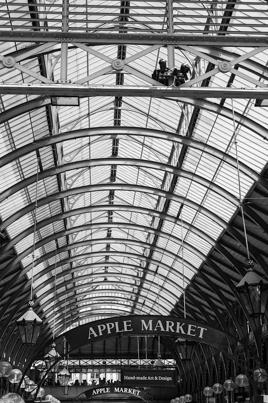
There was one other photograph that appealed as a possible ‘pattern’ and that was taken of the apple market in Covent Garden.  The curves of the roof, and this would make a good contender for ‘curves’ as well come to think of it, has pleasing pattern and I liked the way that the curves of the roof structure are mirrored by the curves of the ‘Apple Market’ signs at the bottom of the image.

Candidate 3 - pattern

Rhythm requires that there is an ‘optical beat’ that draws the eye in a particular direction through an image; there is an obvious parallel with a musical beat here, whereby visual elements of an image dictate the cadence with which the viewer moves through the picture.  I thought that the ‘Boris Bikes’, which are located throughout central London for the use of anyone wishing to risk their credit card in the machine, would proved an excellent example of rhythm, and I set out to find a location and situation where I could both photograph the bikes and have the chance of someone checking out one of the bikes for use.  The first thing I learnt is that these things get little use – at least on the days that I was there – as the racks are mostly full and not many folks decide to risk the roads of Central London!  Fortunately, I did find one willing cyclist taking a chance after spending some time staring at the bikes ..  I’m not sure I currently have a favourite, but will give it some further thought, and maybe print the candidates out and see what I make of it with a side-by-side comparison.  The first one here is a strong contender as I like the person at the end of the row of bikes and also the way he is fortuitously framed against the phone box.
Candidate 1 - rhythm

Candidate 2 - rhythm
Candidate 3 - rhythm

The ‘vertical and horizontal lines’ element is the final set in this post.   This glass office facade has a wealth of vertical and horizontal lines and I really liked the mirroring of the same elements in the reflection in the glass.  It’s a complex image, but it gives the eye plenty to look at and could potentially also be a contender as a ‘pattern’.   A further photograph  featuring vertical and horizontal lines was a glass office frontage in which I spotted the reflection of the Gherkin as an additional level of interest.
Candidate 1 - vertical/horizontal

Candidate 2 - vertical/horizontal

This leaves me with i) two points, ii) several points in a deliberate shape and iii) at least two kinds of implied triangle to work on; I might need one more trip to London as the ‘points’ and ‘triangles’ elements have proved to be quite elusive.  Even though I initially thought that these would be easy to find, it is hard to discover anything interesting that is just a ‘point’ and also to do so without other distracting elements is not always easy.  I do have some potential offerings for these, but we’ll have to see how time goes and whether I can fit in any more shoots.

Sunday, 27 May 2012

Considerations on Colour


A few years ago I was interested in getting some images of water droplets on leaves and discovered one particular photograph by Ernst Haas (1921 – 1986).  This particular image was from ‘The Creation Portfolio’ and was entitled ‘Vermont,1969’ and I thought no more about it, or indeed who Hass was, until researching the theme of colour for this course, when he was rediscovered.  I had hoped to have a theme for each of the assignments for assessment, and much as I had used the London images for ‘Elements of Design’, I am considering using Haas as a potential theme for part of the ‘Colour’ assignment, although I do accept that saturation is not suited to all elements of what I need to achieve.
Ernst Haas was one of the original Magnum (see link in side bar) photographers and was invited to join the agency by Robert Capa as a result of his images of prisoners of war returning home to his native Vienna in 1947 taken when he was staff photographer for the Heute magazine in Austria.  Haas was one of the pioneers of colour photography, making his first colour images in 1949, and published the first colour photo essay about life in New York in Time magazine in 1953. This led to further commissions to produce similar works on Paris and Venice and he was voted one of the world’s top ten photographers in 1958. He was especially noted for his highly saturated colour images taken in natural light - just search Haas in Google Images to get a page full of the most vibrant colour - with prints produced by the dye transfer process, and for his bravery in producing deliberately blurred and out of focus photographs.  He also pioneered extreme cropping of images, shooting into the light and the imaginative use of reflections as a photographic device.
Before his death in 1986, Haas had been working on a book of his work, but it was his children and colleagues who produced the book 'A Colour Retrospective 1952-1986' which was published in 1989 and gave a broad and profound insight into his approach and philosophy of photography.

Edward Steichen wrote of Haas, “In my estimation we have experienced an epoch in photography. Here is a free spirit, untrammeled by tradition and theory, who has gone out and found beauty unparalleled in photography.”

Thursday, 17 May 2012

Assignment 2 : pictures and progress

After another visit to the London Embankment area and the chance to take some more images, the first in anything approaching an attractive light (even saw the sun for a while), I have started to formulate some ideas for submission photographs for Assignment 2.  The objective is to generate a set of photographs directed towards one type of subject, and to generate 10-15 images which exemplify the following effects.  Obviously, these are basically the design elements which have been covered in this part of the course.

·         Single point dominating the composition

·         Two points

·         Several points in a deliberate shape

·         A combination of vertical and horizontal lines

·         Diagonals

·         Curves

·         Distinct, even if irregular, shapes

·         At least two kinds of implied triangle

·         Rhythm

·         Pattern

From my attempts to take photographs to address these challenges, it is clear that some elements are easier to capture than others, and that those which appear to be easiest contain the pitfall of quantity and the associated problem of selection, which of course, is part of what I must start to learn.  I am struggling with one and two points, the simplest things to do I thought, and yes they are, but how to make an interesting photograph is proving to be a challenge ....I have lots of pictures of one and two things of course, but the Embankment area did not lend itself that well to this type of image, or not the type shown by Freeman (2007) or in the course notes anyway. 

There are clearly many different types of architecture available to photograph in my chosen area and I’m pleased with the way that vertical/horizontal, diagonal and curves are going, and rhythm and pattern too have some decent examples to build on.  Implied triangles worked quite well with people and faces, but I have so far not got an image outside this, and I need to get one, as the requirement is for at least two types of implied triangle, which suggests to me that I ought to be looking at three images, and they certainly don’t want to be three pictures of people!

As I have said before, I have decided to go for black and white in this assignment, so I have been spending quite a lot of time converting some of my wildlife images to mono and evaluating the impact of the various adjustments in Lightroom 4.  I chose to do this because I am familiar with these images and have a reasonable idea of what I might expect to see as far as tonality is concerned.  I have moved on from here to look at some of my London images and I’m getting a feel for the sort of conversions I want to do.  Most of my trips have been in flat light with the endless grey cloud cover we have experienced in the south of England for what seems like forever, and these are proving a greater challenge to get to a level that I am happy with.  My most recent trip coincided with a nice bright day with high cloud and a diffuse light, and these images have proven to be far easier to develop with the range of tones that I think I’m after.

In a post back in February, I mentioned that I was looking at the demo version of Nik Software’s Silver Efex Pro 2 program for black and white conversion.  It is certainly easy to use and some of the adjustments are impressive, especially the ‘structure’ adjustment if it is not overcooked.  I’m undecided whether to move to the pay version or whether to stick with LR4 at this stage, although I am sure that used correctly both are good, but SEP2 does seem to be growing in reputation as the premier black and white tool.

So what of the images?  I have uploaded a few that I am considering below, although clearly they may be superseded by photos taken in later visits.  These are candidate images for Curves, One Point and Diagonals.  All have just had a first pass at processing in LR4.  They represent a range of focal lengths from 24mm to 200mm and all were shot with a Canon 5D MkII.
Curves : Candidate 1

Curves : Candidate 2

Curves : Candidate 3

Curves : Candidate 4

One point : Candidate 1

One point : Candidate 2

One point : Candidate 3

One point : Candidate 4

Diagonals : Candidate 1

Diagonal : Candidate 2

Diagonals : Candidate 3

Diagonals : Candidate 4

Diagonals : Candidate 5

Tuesday, 8 May 2012

ASSIGNMENT 2 : Planning (1)


“If a man becomes tired of London, he becomes tired of life”, or so said Samuel Johnson in 1777.

Since starting the course it will be clear that I have used the Embankment area of London as a source of photographs in a number of the exercises, and that a few images also featured in the non-assessed Assignment 1.  Soon after reading through the OCA course notes I think I more or less decided that I would use the Embankment to feature in Elements of Design, the first assessed assignment, as it represents such a rich source of the design elements that the student is called on to produce.  For this reason I deliberately did not use many London images in the Elements of Design exercises leading up to the assignment, as I wanted to keep these for the final submission.  This also made me think more widely to gather material for the exercises.  Obviously London represents a rich source of design elements and there is a plethora of books and guides which can be used for location and inspiration.  Then of course Google Earth and Google Streetview allow us to go on virtual location and identify suitable situations and angles for subsequent photography.  Is it all getting too easy?  Well, no, I don’t think so, we still need to get the composition, the light, the ambience, and the whole feel of the picture right to make a photograph with impact rather than just a picture which is little more than just a record of what was there.

I have little experience of black and white other than the occasional random foray into Lightroom conversions, but I am thinking hard about whether to go for mono for Elements of Design. The OCA course notes actually suggest that mono could be a good approach for this assignment to avoid being trapped by situations where design elements are created solely by colour, but I’ll be giving this more thought.  I have done a basic mono conversion to some of my existing images of London to see what I think, and the outcome is really pleasing.  I’ll be giving this more thought and also taking more images this week when I head back to town to visit the Magnum62 exhibition at the Chris Beetles Fine Photographs gallery, which I’ll blog separately about.

Sunday, 6 May 2012

Exercise 19 : Elements of Design : Curves


The exercise calls for four photographs which show curves and their defining role in demonstrating movement and direction.  I used the opportunity of a day’s photography at the Royal Horticultural Society’s gardens at Wisley in Surrey to look for elements of design and found it an outstanding venue for this with architectural elements as well as plant layouts and the gardens themselves all providing some excellent opportunities.  This was a planned assignment where prior research revealed the likelihood of finding a number of ‘target’ images to comply with several elements of this specific unit.  Curves were certainly available from what I had seen, as were opportunities for patterns and rhythms.  Obviously as a garden where people would be staring at things I hoped to be able to find images for the ‘implied lines’ exercise, although this would clearly depend on what I happened to spot during the day and my overcoming something of a hesitance to take candid pictures of people I don’t know!  It was disappointing that the weather on the day I went was raining and dull which detracted from some of the outside images, creating a rather flat and lifeless light.  Just have to go back.
Curves obviously show a gradual change of direction, and often of rhythm, and therefore as graphical devices are very different to horizontals, vertical and diagonals.  Freeman (2007) describes curves as a series of straight lines which gradually change direction to form the shape of the curve, and I guess that if we regard the way the eye travels along a curve as a series of steps, then that might be regarded as true.  Curves are able to convey feelings of both speed and acceleration and even slight curvature to a line establishes a different understanding in the viewer to that felt if the line was completely straight.  Curves are progressive and give the impression of being flowing, smooth and elegant compared with diagonals which have more dynamic and active qualities. 

Curves need to be real curves to exist in a photograph, whereas diagonals have just to be straight lines which are made apparently diagonal by the viewpoint and/or camera angle ... so curves have to be found rather than created, or at least created by implication where a series of points delineate the shape of the curve.

My first image was inside the new glasshouse complex.  This was only opened in 2007 and contains many flowing elements of ‘modern’ design compared with older glasshouse structures which are often comprised of highly functional, and usually structural, straight lines only.  The picture was taken from the viewing platform at the top of the glasshouse where the rails and walkways have some wonderful curves which have tremendous flow and movement to them.  The photograph was taken with a 70-200mm lens at 70mm which accentuated the curve, and f/8 kept the immediate foreground and background out of focus to further emphasise the sweeping curve of the rail.


The second image was taken outdoors and shows another sweeping curve shape.  The rail is strongly curved and seems to hold back the flowerbed whilst leading the viewer upwards to discover the visitor standing at the top.  The point of focus was where the horizontal line formed by the retaining wooden barrier meets the curved rail and an aperture of f/6.7 allowed the image to run from an out of focus foreground, round the curve to the figure.

The next image was taken on the approach to the glasshouse around the lake and the sweeping concentric curves of the lake edge, grass, flower beds and path I thought had a really dynamic quality to it as it leads round to the structure.  The stripes cut into the grass accentuate the sense of movement in the image and I felt that the few people moving along the path who were mad enough to be wandering around in the rain, also added to the movement qualities of the photograph.  This was taken with a 24-105mm lens set at quite a wide angle of 40mm to capture the whole scene.

I also took an alternative image of the scene at the same time, but with the lens set at 105mm and in a vertical format.  This homed in specifically on the curves, but I didn’t feel that it was as successful an image as it lost much of the direction and dynamism, as well as the sweeping breadth of the first.

My final image is rather different in that rather than a single curve,  it shows a series of linked curves which relate strongly to horizontals and verticals.  This is a close up of the main glasshouse structure which is composed of a series of flowing curves which lead the eye in a rhythmical series of steps to the apex of the building.  I took a large number of images of the glasshouse architecture as features of its design exemplified several aspects of ‘Elements of Design’ extremely well.

This was one of the most rewarding exercises so far because of the ‘assignment’ approach I used, as I set out with specific intent of not using any existing material, but to generate new images as a ‘one off’ effort..  The opportunity to identify a location, use the RHS website to research details and then to use Google Earth to evaluate the likely potential of different viewpoints added greatly to the value of the experience.  I thought the rain and flat light detracted from the visual energy of some of the images, but I’ll be going back there, and at least it stopped too many people standing around on my curves !!

Monday, 19 March 2012

Location, location, location .....

I have given a lot of thought to places that I could visit to take photographs that address various aspects of the course.  These would have to be within reasonable distance of home (less than an hour) and ideally afford opportunities to shoot design themes, colours, lighting etc. in a few visits.  Local scenic spots and buildings lend themselves well to some elements of the course and churches and churchyards are a rich source of possibilities (especially shapes).  One of the best location types I have found for design elements and people are preserved steam railways (no, I’m not a train spotter!) and these also give opportunities for shooting colours and movement. 
London obviously has limitless photographic opportunities, although I have chosen to focus on the Embankment area to reduce the strong likelihood of chasing off after too many themes! 
The potential locations that I planned to include in TAOP have been marked on a map that has been included in my hard copy Learning Journal along with the subjects that I plan to focus on when I am there.
I have learnt so far that it is good advice to have a list of shots I definitely want to take before visiting a location and then to ensure that I capture these to their best advantage with respect to distance, angle and lighting before getting diverted onto anything else.

Saturday, 17 March 2012

On the road again ... London revisited


March 15th and another visit to London.  This entry is reproduced in longer format in my hard copy Learning Journal so I can include copies of images from the exhibitions.  This blog version contains web links only.
This time, the plan was to move along the South Bank from Waterloo down as far as the Design Museum which is just beyond Tower Bridge.  This takes in some excellent locations for potential course photographs including the Millennium Bridge and the view to St Paul’s cathedral (lots of curves, triangles, diagonals, colours, contrasts and people .. and much more) and also takes in the Tate Modern, located in the old Bankside power station.   

I had a good idea of what I had expected to find and photograph along this stretch of the embankment as far as the London scenes were concerned, but there was also one excellent opportunity that occurred that I was not aware of.  There is an open space area where graffiti artists have been able to spray their pictures and I spent some time exploring the relationships between the colours and textures of the various surfaces.  Shafts of light penetrating between the concrete structures also afforded some opportunities to photograph the impact of light and shade on colour.  Just one of the pictures I took is shown here, but I am sure these will feature again in later elements of the course.


There are several current exhibitions of photography at the Tate Modern including ‘New Documentary Form’ which “explores the ways in which five contemporary artists have used the camera to explore, extend and question the power of photography as a documentary medium”.

The artists were Mitch Epstein (images around American energy production), Guy Tillim (documentary of the political situation the Congo), Boris Mikhailov (politics in the Ukraine), Luc Delahaye (novel approaches to social and political photography) and Akram Zaatari (portraits of ordinary people in the Lebanon).
There was a large amount of material in the collections and I found particular interest in the work of Luc Delahaye and Mitch Epstein.  The attraction of Delahaye, a former Magnum Photosand Newsweek photographer, were his remarkable achievements in war reportage photography whilst using only a view camera with its capability for taking only single frames at a time.  Much of his early work, recognised by an array of photojournalism awards like the Robert Capa Gold Medal on two occasions, was more ‘in your face’ war photography, although latterly his images have been more considered and remote from the immediate brutality of conflict.
O’Hagan (2011) in The Guardian describes the contribution of Delahaye thus: “His more recent work, as the three images at Tate Modern show, is characterised by its size, detail and detachment. Here, as is the case with Robert Polidori's photographs of the aftermath of Hurricane Katrina, art photography and photojournalism converge. Back in 2003, when Delahaye showed selected images from his History series at a private gallery in New York, including a beautifully composed portrait of a dead Taliban fighter lying in a ditch, he caused considerable controversy for mixing art and reportage, as well as for the attendant art-world prices the photographs commanded".
 "Jenin Refugee Camp" taken by Delahaye in 2001 was the image that for me had the greatest impact.  The remarkable level of detail coupled with the distance from which the image was taken really gave the impression of an outsider looking in, or maybe intruding, into the tragic reality of the scene.  Interestingly, Delahaye has set the horizon right through the centre of the scene, which must have been a considered choice, although the use of the light to focus attention on the scene and the framing from the rubble in the foreground, really pull the viewer into the picture.
Mitch Epstein's ‘American Power’ collection is in total contrast to the aspirations of Delahaye.  Epstein focuses on the specifics of American power generation and consumption and its environmental and social impact.  The photograph ‘Gavin Coal Power Plant, Cheshire, Ohio’ taken in 2003 was my favourite in that a really unusual angle was used to photograph smoke emerging from the power station chimneys and it took a few moments to recognise what I was actually looking at – something seemed to be upside down initially, but it is just a very clever interpretation of the scene and use of angle of view.  The spiral twists of the smoke plumes make the image outstanding in my view.
The other Epstein images in the ‘American Power’ collection did not raise as much interest as the smoke plumes, but ‘Amos Coal Power Plant, Amos, West Virginia’ taken in 2004 was an interesting observation of the impact of power generation on ordinary life as the huge cooling towers very close to residential property overshadow everyday living and completely dominate the scene.

References
O’Hagan, S. The Guardian, 9th August 2011


Friday, 2 March 2012

Wildlife Workshops in Scotland


I have just returned from a ten day trip to Scotland to photograph some of the wildlife in the Cairngorms National Park.  The trip was in two parts, the first organised by Northshots and was guided by Chris Gomersall and Rob Jordan, and the second by Neil McIntyre of Scottish Wild Images, all established professionals in the area.  I can’t resist posting just one image from the trip, but see my website for more.

Technical details   :   Canon 1D MkIV + 500mm f/4 L IS lens   :   1/125sec at f/6.7 and ISO200

In addition to affording numerous opportunities to add images to my wildlife collection, I also managed to shoot some material relevant to TAOP which will doubtless appear over the course of the next few months. Additionally, I tried to revisit a number of aspects of the course so far, particularly exploring the role of shutter speed on moving water, as I had previously done in Exercise 4.  A rather more extreme approach was taken this time, with a 0.8 ND filter being used to reduce shutter speeds to 15 – 30 seconds to remove all definition from the water cascade and make it almost look like flowing ‘steam’.  The first image is a close up of the water cascading over rocks taken with a 15 second exposure.

A second shot I experimented with was with the river itself, again utilising the ND 0.8 filter to slow shutter speed, on this occasion to 20 seconds.

Technical details   :   Canon 1D MkIV + 70-200mm L IS lens at 163mm   :   15sec at f/16 and ISO100

Technical details   :   Canon 1D MkIV + 24-105mm L IS lens at 24mm   :   20sec at f/22 and ISO100
I have worked with Chris Gomersall a number of times in the past on bird photography workshops, and this photo tour happened to coincide with the release of his latest book "Wildlife Photographer", an excellent exploration of the more artistic and creative aspects of wildlife photography.  I've got a very long way to go ..... !!

Thursday, 9 February 2012

A grand day out ....

Further details of this post and selected images from the exhibitions can be found in my hard copy learning log which will be submitted at assessment.

On Monday 6th Feb I went to London to make my annual visit to the World Wildlife Photographer of the Year  exhibition at the Natural History Museum.  As always there were some stunning images and I’m always impressed with the effort that goes into getting the shots at both the technical and travelling level!  Over 50,000 images are submitted in a variety of categories (see the link) in what is the world’s premier wildlife photography exhibition.

I always look at the birds section first as this is an area where I do my own specialist photography.  This year the winner was Steve Mills with ‘The Assassin’, a stunning image of a merlin that had just caught a snipe.  This one has everything for me – not only the technical excellence of the image itself, but the perfection in the way that the wing and the bill of the prey frame the face of the killer.  The talon holding the snipe sets the image off with a superb splash of colour in a bleak winter environment.  Just magic.

My next port of call was the Taylor Wessing Photographic Portrait Prize exhibition at the National Portrait Gallery.  This was the first time I have been to a photographic exhibition other than wildlife and it left me with mixed feelings.  Some of the photographs displayed were stunning in their detail and in the impact that they generated, whereas others were, at least to me, just snapshots of people that conveyed little in the way of message.  The winning image ‘Harriet with Gentleman Jack’ was a simple shot of a girl with a  guinea pig that had a great spontaneity to it rather than the heavily posed and contrived impression I got from some other photos on display.  There was the usual sprinkling of images that crop up in portraiture that left me wondering whether they were intended as photography or pornography, and generally they fail on both counts!