Showing posts with label 0 Personal development and learning. Show all posts

Wednesday, 16 January 2013

Final reflections on The Art of Photography


TAOP is complete and submitted for assessment in March 2013, so it’s time to consider a final evaluation, a self-appraisal if you like, of what I have achieved and what I have learnt, as well as to consider what went well and what didn’t.
First and foremost, it has been enormously enjoyable, and that’s what I started the course for.  Like many OCA students, I’ve done the scrapping for marks and grades in an earlier life, so this was all about expanding my photographic horizons beyond those I have previously developed as a hobby wildlife photographer, and trying to connect with the artist aspects of making images. 

Distance learning has been an interesting and new experience for me and one I have enjoyed.  I think I have maintained motivation throughout the first year and apart from a few employment related slowdowns in output, have maintained a consistent pace throughout the course and certainly never lost focus on what I was trying to achieve.  Given that there is no cohort entry into the OCA courses it is expected that as new ‘rules’ and documentation are issued they appear at different stages of a student’s progress and additions to reading lists and availability of clearer assessment submission guidelines materialised towards the end of my first module. I don’t see that as a problem, just an observation of an inevitable part of an open entry course.

There is opportunity to spend several years over TAOP if I had wished, and with that could potentially come the chance to go and re-shoot assignments to try and improve submissions based on feedback, growing knowledge and experience.  However, I resolved from the outset that I would get this done in one year if work allowed, and I certainly don’t feel that I would gain significantly from repeating what I have already done.  I am sure that I could garner a few extra assessment marks if I went back and photographed again some of my early efforts, and I could definitely add a lot more ‘learning’ and study visit experiences, but that would defeat my personal purpose.  On the student forums there does seem to be a lot of debate over marks and comparisons between achievements, but given that students can build work over a flexible number of years, I don’t really see this as particularly valid.  I will gain more from moving on to DPP than I will from dwelling on TAOP I think.

There is no doubt that I have developed a far greater awareness of possibilities for photographs when I’m out with the camera, and as I will elaborate later, have developed the beginnings of an instinct for spotting contrasts and design elements and for pictures that ‘work’.  This has been a huge improvement in my photography and probably the biggest change attributable to spending the time on TAOP.

Contrasts
Contrasts was the first opportunity to photograph to a ‘set’ brief, albeit a very wide one.  This was not as simple as it seemed and initially I fell into the trap of assuming knowledge on behalf of the viewer would inform their understanding of the contrast portrayed, rather than solely using the images to show unequivocally what the contrast actually was.  However, some helpful tutor guidance steered me away from a couple of early blunders and I was pleased with the set at the time.  However, looking back after nearly a year, I do cringe at several of the choices and would certainly never repeat some of the shots I took back then.  This is good, as it clearly means I have changed in my views and thought processes and I am sure that I could go back now and interpret the contrasts in a far more imaginative way and deliver some better images than I did with quite a constrained approach in the early days.  I think the biggest change in my photography over this year has been the expanding ability to think more widely about the subject when interpreting a brief and not be too limited by precise instruction, although at times I have found this hard as I don’t think I have a very artistic way of thinking about things.

Elements of Design
This was an opportunity to investigate shapes and I think was the high point of TAOP as far as the photographs I took were concerned.  I decided to use the Embankment area of London as a theme for the assignment and also chose to work in black and white so I could focus on design and shape and not be deflected by the presence of colour.  Getting narrowed down to a location and a medium from the outset worked well, as did the opportunity to make a number of visits to improve and expand the portfolio of images from which I eventually drew the submission.  I found that I started to spot ‘elements of design’ quite easily after a while and this has not stopped since, becoming a regular feature of my photography – I often spot and photograph ‘shapes’ that fit this brief and have collected a great many more over the last year, although I have no plans to start replacing the originals I submitted. 

Colour
Well I thought this was going to be easy, everything is coloured, right … ?  And that was part of the problem.  Deprived of the focus of a topic and left to photograph anything, I got somewhat derailed at the start by trying to be too precise in finding the exact colour and in trying to compose images where the colours I wanted were just too large a part of the picture and in too precise a ratio.  I didn’t think the course guidelines were too helpful in this respect, although Michel Freeman’s Photographer’s Eye set me down the road to what I think I was trying to achieve.  I tried to get a mixture of still life, outdoor and indoor images for this assignment, although I guess the easiest option would be to go for still life indoors and select a topic such as food where colour and proportion could be more easily controlled.  This was one Assignment where I did decide to make a few late changes in images for final submission for Assessment, so hopefully they are an improvement. 

Light
In the initial exercises I experimented with a couple of statues and vases, which served well to develop some rudimentary lighting skills and an understanding of how to emphasise various features of a subject.  However, my final choice was a loaf of bread as suggested by my tutor.  This indeed worked well and I was able to illustrate shape, colour, form and texture indoors with lights and candle light and outside with sunlight.  The biggest improvement here came with the purchase of a couple of decent constant lights and attendance at an RPS portrait photography weekend workshop, both of which gave me the chance to practice the impact of lighting changes, and both of which gave me a real boost forwards for later parts of the course.
The work with the loaf took me quite some time and numerous attempts to get the images as I wanted them without having to do much in Photoshop afterwards.  This was an important personal goal here as I wanted to learn to get it right in camera and not to substitute post-production for what I ought to be able to get right in the first place.  I also discovered that unless you have a series of stands and clamps and an assistant, you need four hands to set up some lighting arrangements.

Illustration and narrative
The subject for this was to a large extent dictated by the time of year.  Indeed there are many events around Christmas that could potentially be researched and photographed, but they tend not to be occurring in my life and work in any way that I could envisage being available to shoot a sequence of images to tell a cohesive story.  I eventually went for the concept, design and fabrication of a piece of silver jewellery which gave me an interesting number of technical and narrative challenges.  However, it did give me a subject  to which I had ready access and was able to shoot on a number of different occasions to fulfill the objective of telling a story from beginning to end, and hopefully using a range of the techniques which had been covered on the course thus far.  I had the aspiration of bringing shutter speed, ISO, exposure compensation, focal length, use of colour, lighting skills and composition into the images and then using what I had learnt of illustration to compose images of different sizes into a final document.  I was really pleased with the outcome of this as the final output from TAOP and I would not have done this anywhere near as well a year ago.

Finally, there are the other parts of the course and the learning that went with the practical photography.  I read a number of books which were on the reading list for TAOP as well as some recommended by my tutor and others that I discovered along the way or through discussion on the student forums; these have mostly been reviewed elsewhere on this blog and my thoughts can be found under the Book Reviews tab in the side bar.  Apart from the technical material, the rest was new to me and I derived a great deal from the coverage of the history of photography and the works of various celebrated photographers and fine artists.  I also, for the first time really, started to appreciate pictures from their artistic point of view and developed some basic skills and knowledge in the reading of a photograph, although I do fundamentally disagree with the interpretations propounded by some authors where I am sure they are reading far too much into serendipity.  A debate for another day and another module though …

The four OCA study visits I attended were a vital element for me in not only getting the opportunity to talk through images with tutors and other students, but also to be able to put names to faces of some of the people I ‘met’ through the OCA students forum and through the Flickr site.  Several of these have been an excellent source of advice in matters relating to the course and in offering help and encouragement through TAOP – you know who you are, so great thanks.  Everyone has something new to suggest and books and websites which have contributed to my overall learning have been numerous.  I was also able to make a number of gallery visits on my own, and again the learning from the course enabled me to really start to get to grips with some of the images I saw.

The OCA Photography student’s weekend residential event in Leeds was a great success for me and it was the first time I had met face to face with several people I had been corresponding with online and the chance to have informal discussions with tutors and other students was invaluable and enriched the whole learning experience.  The lecture content suited me well and I thought the portfolio session was a real eye opener as it was the first time I had produced images other than wildlife shots for critique and discussion. Although it is difficult to achieve I would like to see some form of ‘live’ tutorials taking place as it just adds so much to breaking inevitable barriers associated with distance learning.  I have recently become involved with a regional Thames Valley OCA group, so hopefully some of the plans to meet informally as a student group will come to fruition.  Our first gathering at Somerset House in January to look at Henri Cartier-Bresson was certainly a successful venture.

Blogging was something I enjoyed and I really forgot the online element and public visibility very quickly and just got on with it.  Blogger has some irritations and seemed unreliable with the placement of pictures unless you just wanted them lined up down the middle of a page, and its handling of text was at times bizarre.  However, as long as it was kept simple, it worked well enough, although next time I will structure my blog differently with greater emphasis on the learning and less on the exercises and assignments.

I was glad that I kept the hard copy learning journal as well as the blog, as it gave me somewhere to consider images which were not available on line.  However, as I became more aware of the excellent and readily available press packs which galleries were willing to make available to students, and how willing some quite well known photographer were to grant access to images with acknowledgement, the hard copy journal got used far less.  I may continue with this is the future, although at the time of writing I’m not convinced.

Tutor responses to assessments were rapid and very helpful, with valuable pointers on how I could improve images and my approach as well as helpful suggestions on reading. 

This will just about be the last post in this TAOP blog apart from when I add the final mark in case it is of use to anyone who reads this far in the future, so it’s off to DPP ……

Sunday, 13 January 2013

Study visit. Henri Cartier-Bresson: a question of colour


'You'd have to be dead not to feed off the energy contained within this exhibition'

Alastair Sooke, The Daily Telegraph


The first study visit of the new year and the chance to join folks from the newly formed Thames Valley regional group of OCA photographers at the Cartier-Bresson :  A question of colour exhibition at Somerset House in London.  This is a multi-function venue, plus ice rink, which provides gallery space for various art shows and had dedicated four rooms to this exhibition.  The objective was to showcase ten HC-B photographs which had never been exhibited in the UK before alongside seventy five images from fourteen internationally recognised artists who worked in colour, eschewed by HC-B himself apparently on the grounds of its technical (at the time) and aesthetic limitations, but followed his ethos of capturing the ”decisive moment”.   I felt that there was some very wide interpretation of this in many of the pictures shown and there was to me sometimes the lack of a ‘decisive’ element.

Exhibition curator William E Ewing encapsulated the reason for the exhibition perfectly when he said "My proposition is simple: take the ethos of the decisive moment, and look at how colour photographers have actually fared. Put differently, if we take Cartier-Bresson's scepticism about colour photography as a challenge, how convincing is the response?"  HC-B is pitted against overwhelming numerical odds as well as having pictures shown that are drawn from lesser known examples of his work, and his relatively small images are pitched against the likes of the often far larger and imposing works of Boris Savelev, described in The Times as having a ‘cruel grace’, and the very loud work of Robert Walker to name but two.  A great deal of what is shown from all artists would fall into the category of street photography of one sort or another and I felt that HC-B’s images were often quite calm and contemplative, certainly compared to the action of Joel Meyerowitz.  Some of the work displayed was from photographers of similar age to HC-B, and Helen Levitt, Ernst Haas (whose wonderful vibrant colours I have blogged on before), Saul Leiter and Fred Hertzog were amongst these.  Hertzog was not a photographer I have come across before and I loved the beautifully composition and muted colours in images of his native Vancouver in True Story 1959, especially Old Man Main where the sharp, dense shadows fall contrastingly across the faded paintwork.  Saul Leiter’s street scenes often made use of reflections and images distorted by refraction through glass, with snow or rain further scrambling the image detail, although a photograph of a girl in a cafĂ© (Paris 1959) made me think most of parallels with HC-B as it seemed quite a contemplative shot.

Boris Savelev had some imposing images which were printed on gesso coated aluminium and gave an almost lustrous but flat effect with very deep shadow which I thought suited the images of Moscow on show.  Interestingly, the images of Dog Moscow, 2007 I have found on the web seem far, far brighter than my recollection of the picture in the gallery, although it was done no favours by its particular hanging location as far as incident light was concerned.  From Joel Meyerowitz’s Intersections came Camel Coats 5th Avenue which is just brilliant with two couples walking away into the steam, with the shadows of people further behind falling perfectly on the backs of one of the couples – that one certainly was a decisive moment… 

The images most similar to HC-B I thought were those of Helen Levitt.  Levitt was a New Yorker, born in 1913, and therefore of a similar generation to HC-B, so maybe it was not surprising that she produced photographs of the city with a similar feel to them, at least to me.  Cat next to red car, New York, 1973 shared many of HC-B’s great compositional balance and interest around the frame.  Girl in a window, 1972 was a stunning image with the way the bars in the window separate the girl’s eyes from the rest of the face and the reflection in the glass of the buildings opposite add to the feeling of the girl somehow being locked in, although I have no idea whether this was the case.  Looking after the exhibition at some of Levitt’s early black and white work there were even greater parallels with HC-B’s photographs and interestingly they have been exhibited side by side in New York recently.

A final artist I’ll comment on is Australian Trent Parke.  Parke’s street work shown was from 2006 and examples such as George Street OJ and Today cold water, George Street, Sydney were wonderful mixtures of bright colour and intense shade, but with the figures picked out beautifully in the patches of sunlight.  They were very vibrant images, both in terms of their colour saturation and use of shadows and in terms of the movement of the people going about their lives.

So, overall, did HC-B meet the challenge, if indeed that is what it was meant to be, of the colour workers?  In my view he certainly did and stood alongside the more numerous colour artists by virtue of his superb compositional skills and balance in the images, although I would have been fascinated to be able to make the comparison between all the artists with a set of black and white prints of the same size from each …

Wednesday, 2 January 2013

Book review : The Genius of Photography: Gerry Badger

Gerry Badger’s The Genius of Photography is a book that I have been dipping in and out of throughout the time I have been working on TAOP and was one that I first came across when watching the television series of the same name a few years ago.  Essentially, it is a book that covers the various photographic movements through the twentieth century and explores developments via the key events, people and photographs that defined the era.  The evolution of photography from the earliest images by Niepce to the end of the century and slightly beyond (2006) is covered in a succinct way and the social context of the imagery thoroughly explored and exemplified with around twenty key images in each section. 
The historical coverage was the major element in the book for me and the treatment of the development of social documentary photography and the start of photography as a political and propagandist tool especially so.  The third chapter, Some decisive moments (maybe?), gives an interesting appraisal of (mostly) war images from Robert Capa (Loyalist militiaman ..etc), Lee Miller and her post-war documentation of the Holocaust and its victims, Don McCullin in Vietnam and Luc Delahaye in Iraq and discusses points around how photographs can be tailored to a cause via the way they are taken and edited, and indeed how events in war can also be manipulated to suit photography.  Face to Face looks at portraits and how they developed in an historical context and how they can generate and channel emotional responses, and Badger very succinctly states that a portrait “ … is capable of immortalising and creating myth.  It can confer acknowledgement and bestow dignity.  It can also stereotype, debase and dehumanise.”  The chapter starts with Nadar’s photograph of Sarah Bernhardt from 1863 as a fairly uncomplicated image and travels a path through Paul Strand and Walker Evans and others, concentrating on the ‘reading’ of the images and what could potentially be derived from them other than just the face in the portrait.  Nudity gets quite short treatment and seems to focus mostly on where the images taken have been sympathetic and often taken in an apparently willing collaboration, although he does briefly cover the uncomfortable looking subjects of Diane Arbus and self-portraits of Jo Spence as she explores the demonisation of the aging female form.
There are two sections at the end of the book which I found especially useful and interesting.  Firstly, there is an historical timeline of the development of photography to the modern day paralleled with major world events which occurred at the same time set alongside, and secondly a glossary of the terms used over the years to describe different print processes.  So, if you want to know the differences between your gum bichromate print and your palladiotype, then this is the place to look.
The book is quite a large format (23 x 20cm) and the images are clear and well set out, although I did find the sudden appearance of large bold font in the titles of some of the images quite strange.  It is a book that has been well reviewed elsewhere and one particular quote from Martin Parr caught my eye “An excellent primer and leads us through the complexities of understanding what makes a great image .. Badger’s book lays out the debates in a clear, authoritative way.”  I’d certainly agree with that, and I found the book immensely readable and engaging throughout and will be a resource that will doubtless find use again as I progress.

Wednesday, 19 December 2012

Book review : Behind the Image : Fox and Caruana

Behind the Image, by Anna Fox and Natasha Caruana, was not on the reading list for TAOP when I first started, but since then it has appeared as an essential reader for this introductory module and indeed for several other modules on the Photography degree path.  It is essentially a guide to the tools and theories which underpin photographic research and focusses on the processes that drive successful photographic projects. As such, it is clearly an ideal companion to many of the projects we undertake as part of OCA study. 

The book is immensely readable and draws examples from a range of photographers covering different areas of practice.  The initial chapter sets the scene with an overview of the essential processes from planning a project, moving through the research phase and finally to delivery.  The authors focus on several key areas which I think are likely to get overlooked in the rush to take pictures, and these are the actual title of the planned work and its intended audience, obviously key factors but easy to pass by, and they also emphasise the benefit of a solid research proposal in driving the structure of the final work.  The first chapter concludes with a review of the work done by Natasha Caruana in documenting the Aberfan mining tragedy and emphasises the importance of building up a relationship with the people involved in both the history and present of a project and pacing the development of this relationship to eventually gain deeper access to their lives and really start to understand and photograph the impact of the event.  Record keeping and the potential value of mind maps in developing ideas and project strategies are also covered, along with some suggestions of how to utilise these.
Sourcing research materials and collating their contents is covered at some length, although I found this personally less useful as it is close to what I do in real life, as is the keeping of accurate research records and records of personal ideas.  Another suggestion was to actually take photographs of yourself working and record the process of the development of the project rather than just shooting images as potential final copy.  I tried to adopt this idea when I was doing the Light and Illustration and Narrative assignments and found it a really valuable way of retaining ideas and recording personal progression.

There is an interesting section on street photography which emphasises the need for research here too.  Things can happen fast and Fox proposes location visits to look for good angles, backgrounds, light direction and situations that might arise, or indeed can be made to arise.  I have yet to make any sort of serious effort at street photography and it is good advice.
There is extensive coverage of post-production and editing for different photographic genres from street to fashion and again the emphasis is on exemplary record keeping, both of practical aspects of the project and of ideas and thoughts as the project progresses.  One of the most interesting aspects is around the taking of numerous ‘test’ photographs as an active part of the research process, as a route to identifying the final images and as a mechanism to attain continuous improvement.  This is less applicable to street photography than to work in a studio, but I am personally aware that that I just don’t take enough images as I progress through a project and try too hard to conjure up what I visualise as the final image too soon in the process. 

The chapter on ‘Compiling your research’  is highly applicable to the OCA course as it covers workbooks, sketchbooks, blogging and storage of archive material.  It even suggests starting your own blog, so at least I’ve got one thing right …

Overall, the book has an emphasis on the understanding, evolution and recording of research process as a continuum which allows later reflection and expansion in the light of developing experience.  It draws from some excellent examples in terms of the specific real projects described (Aberfan was for me the most poignant and meaningful of these, but then I’m old enough to remember it) and how they were researched and executed.  The text is lively and easy to read and the layout and reproduction neat and clean.  Well worth a read to emphasise some key pointers in getting project photography right from the outset, though the £23 price tag is steep for what is on offer I thought.

Saturday, 1 December 2012

Thoughts on natural lighting – classic and current


With many thanks to Mitchell Kanashkevic for kind permission to use three of his images.

I’ve been somewhat taken with the possibilities around the control of light, and the RPS portrait lighting course has had a major impact on how I have been thinking about this.  Obviously this is one of the key elements of art and photography as far as portraying the human form is concerned, so I have done a little research into the great practitioners of lighting in art through the ages as well as those in the photographic medium.  However, rather than artificial lighting, I have been considering the use of natural light and the great exponents of this.  I certainly don’t intend to produce a lengthy review of all those who have been claimed by commentators to be the greatest, and there are many, but have singled out two for discussion.
Having recently watched through all eighteen available episodes of Tim Marlow’s excellent Great Artists television series, I focussed on Johannes Vermeer as someone whose use of natural light to capture human form and emotion shows, at least to me, a superbly lifelike quality.  On the photography front a friend suggested to me that I might look at the works of Mitchell Kanashkevic for someone who’s photojournalistic and travel work makes wonderful use of available light to portray people.  I wrote to Kanashkevic and was delighted to get a reply almost by return granting permission to use a couple of his images to illustrate my ramblings.  His website is well worth a look if you like travel photography and stunning use of natural light.

Starting with Vermeer, I think there is an almost ethereal quality to his paintings, and although frequently portraying light from a window to the left of the subject and attracting criticism from some writers for this, the qualities that the light draws from the faces and fabrics is simply stunning.  I have selected three to show here, and firstly chose Girl with a Pearl Earring, painted in 1665, as it is set against an almost black background and the use of the light on the mouth and the earring itself has remarkable vibrance and vitality.  If this was a photograph it would probably have been shot with a light facing the front of the model and a black backdrop to avoid reflecting light onto her back, and a reflector and flags used to selectively light the head scarf.  This has always been one of my favourite paintings simply because of the light, an expression that somehow seems very knowing, and to me shows a connection with the artist that is almost photographic in its quality, remarkable given that it is obviously not a fleeting moment in time as a photograph would be.
Girl with a pearl earring. 1665.  Vermeer

The Geographer shows light on a complete scene, yet the details on the face and clothing is again remarkably picked out by Vermeer as the sun apparently streams through the window; even the up lighting from sun hitting the open map or book can be seen to lift the shadows in the painting of the face.  It shows a remarkable understanding of the how light behaves and it would be fascinating to know the extent to which this was posed in the conditions portrayed and how much was Vermeer’s interpretation and licence.  Photographically the window is being used as large softbox to cast soft, diffuse shadows and the map is utilised in the same way as the large reflectors were used in the model shoot that I posted about earlier.  The Kitchen Maid, painted in 1660, was selected as there was appeal in the way that the light is graduated from the bottom left to the top right of the image as the natural light comes in through the window, picking out both the food items on the table and facial features of the maid herself.  Not unusually for Vermeer, there is a significant empty space lit to the right hand side of the painting against which the primary subject is framed.

The Geographer. 1668. Vermeer

The Kitchen Maid. 1660.  Vermeer

Moving on to Kanashkevic and his naturally lit travel photographs, my first image is Sulfur miner, Ijen Crater, East Java, Indonesia.  2008 and was actually the image that started me thinking in the direction that led to my candle light shot in the Light assignment.  There is a lot on  his website about the setting up of this image and how long it took to get the lighting right with the guttering torch and the departing figure in the background, but it captures the wind by the direction of the flame and the light falling perfectly on the face, clothes and baskets;  the cigarette burning in his hand in my view adds to the image and the early morning light has also just picked out the miner heading down the slope, separated from the primary subject by the mountain silhouette in the background.
Old orthodox Russian priest and his wife, Braslav region, Belarus, 2009 was a photograph that captured a face with a history and the lighting from the window on the left hitting the face and arm was similar to the lighting in some of the Vermeer paintings in its intensity and quality.  I appreciate that this is a well worked lighting device employed by a million photographers and artists but me for there are strong parallels here.  I like the way that the light just catches the face of the priest’s wife in the background, although she is clearly a peripheral figure in the photograph, and may well have also been in reality.  Lastly, Tea maker’s son, Rajasthan, India, 2007 struck me because of the strong and harsh directional lighting and shadow depth as the sun streams through the entrance to the area in which the child is sitting.  The powerful natural light overpowers the light that must be coming from the fire and restricts it to just the orange glow from the inside of the oven, which along with the steam rising from the pot, makes it a warm image in spite of the harsh and almost cold and bluish lighting from the right .  The catch lights in the eyes make this picture for me as without these the child’s face would seem lifeless and dull.

Sulfur miner, Ijen Crater, East Java, Indonesia.  2008 
Copyright Mitchell Kanashkevic.  Used with kind permission.

Old orthodox Russian priest and his wife, Braslav region, Belarus. 2009
Copyright Mitchell Kanashkevic. Used with kind permission

Tea maker's son, Rajasthan, India. 2007
Copyright Mitchell Kanashkevic. Used with kind permission

Although I could write reams on natural light in painting and photography, and indeed there are many thousands of comparisons available to read, coupled with millions of images, I felt it was a worthwhile endeavour to highlight a couple of examples which had particular personal appeal as I think that both have relevance to the Light module and expand a little on what I learnt on the RPS workshop.

Wednesday, 21 November 2012

Lighting studio portraits - the pro way ..

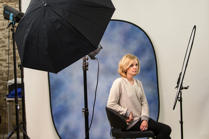
As part of my developing interest and understanding of light, I have recently been on a two day studio portrait photography workshop booked through the Royal Photographic Society and tutored by Chris Burfoot.  I have mentioned in a number of posts before that the Light module was the first time that I have really made any great effort to take photographs inside and get a grip of the lighting requirements to do so effectively, so this seemed an ideal opportunity to get some tuition in the area of portraiture and also to try out some top end professional kit instead of my pieces of silver foil, cardboard reflectors and tracing paper…..  The kit used throughout was Broncolor flash, which is as good as it gets, Lastolite reflectors, and a Hasselblad camera was available to borrow to see just what image quality can really look like (I thought my 5DMkII was good, but the H40D produces images from another world).

The course is based on flash and the pro studio units generate lighting like the surface of the sun compared to my two constant lights or Canon Speedlites.  The two days were so good because they generally covered the same aspects of lighting as are in the OCA light module and there was some commonality in approach as form, shape, colour and texture were emphasised throughout.  We started off with a simple single light setup, then introduced a reflector, then two lights, hair lights etc. and covered the lighting options as listed below.  We also worked with coloured, black and white backgrounds.
Cameras were used exclusively in manual mode and exposures set by use of flashmeter readings and adjusted with the controls on the flash heads, and of course I have to mention the endless patience of the model who smiled and posed for hours over the weekend.  One of the most valuable lessons for me was in the placement of reflectors and I was surprised how close these actually were to the model.  Given the massive light output of the flashes the reflector panels were often only 30cm or so from the model’s face, and that surprised me, but the panels are huge and made for a wonderful large source and therefore soft lighting, ideal for portraiture.

Front light + reflector + hair light with snoot + blue background
Taken with the above set up
Front lighting + reflector just under the hand
Front light high and pointing right down + triple reflector just below frame.  You can see the multiple catchlights in the eyes

There was a lot of other information discussed around the business of portrait photography and I picked up some websites to see how the pros do it.  So if you want to hire a fully serviced studio big enough to photograph a double decker bus have a look at BigSky London, and to see some amazing top end work that’s a bit different, try Ben McDade and Tim Flach.
  • Flash or Continuous light - advantages and disadvantages.
  • How a studio flash works.
  • Setting up a portrait with a single light.
  • Changing the quality of the light with simple accessories.
  • Placing the main light. Using a simple reflector.
  • Using a flash meter and setting your camera.
  • Adding a second light.
  • Light control accessories.
  • Hair/background lights.
  • Getting more depth into your portraits.
  • Using a main and fill light.
  • Balancing light sources with a flashmeter.
  • Lighting a white background - not lighting a black one!
  • Softboxes - stunning portraits with a small softbox.
  • Positioning lights and subjects.
  • The inverse square law

  • Using larger softboxes to create lovely soft lighting.
  • Hard, high contrast lighting. Mixing hard and soft light together.
  • Lighting for full length. The white background, for children and contemporary portraiture.
  • Camera viewpoint.
  • Using a lightbank as a huge soft light.

Wednesday, 14 November 2012

Book review: Reframing Art


Carter, M., Geczy, A.  Reframing Art (2006). Australia.  UNSW Press

‘Reframing Art’ by Michael Carter and Adam Geczy was suggested by my tutor as a worthwhile introduction to the concepts relating to art history and theory.  Although it is certainly not a photography book in any way, many of the concepts pertinent to painting, sculpture etc. also relate to photography as an art form.  The book starts by asking what art is (possibly one the of the world’s most long running debates) and moves through art works as symbolic objects (touching on some of the semiotics we discussed in the residential weekend in Leeds) and finally explores how we look at art, how it is exploited as a commodity, how it is displayed and the sort of audience that views art.  All the chapters are developed from relatively simple beginnings and the more complex areas such as the temporal progression of art objects from a starting point of often low value raw materials through to their emergence as potentially major investments, are explained thoughtfully and logically.
The text is more accessible than some of the art books I have explored recently and is certainly a significant move away from the challenges of Graham Clarke, a writer with whom I have somewhat limited resonance, although I concede that I am beginning to get a grip on his book as the course has progressed.  In the second chapter of Reframing Art the authors explore public perception of artists and make the point that over the last 150 years there has been very little change in how artists are generally portrayed, and in fact often caricatured, in the media.  They describe the stereotypical artist as “ .. nearly always being depicted as a peculiar kind of person: a bit mad.  He (and it always is a he) is someone who make subjects or creates experiences that are generally incomprehensible to patrons of the work and the general public.  The fact that they look different to the rest of the population is most telling.”  I wonder to what extent ‘artists’ have deliberately perpetuated this persona though, as indeed do many groups in society.  I’m sure I fit the ‘mad scientist’ bracket quite well …

Another feature of this chapter was the description of the collaborative nature of many great paintings.  Having never studied art in any way before, I had not appreciated the extent to which ‘the master’ left significant amounts of the painting of pictures to students and how many great works are a collective of different contributions, with the named artist often just applying their style in finishing off key elements of the pictures themselves.  One example of a major piece of collaborative art given in the book is Rembrandt’s ‘The Gold Weigher’ where the hand of the master is only apparent in certain key areas of the image, with much work having arguably been done by pupils.  This is perhaps analogous to photographers who specialise in elaborate tableaux settings involving large crews of assistants, lighting engineers and actors.  Gregory Crewdson springs to mind, and although he is directing and taking the photograph, many others are contributing to the generation of the final image.  Just a thought.
Wittenboogaert, The Gold Weigher  - Rembrandt
Rembrandt:  The Gold Weigher
 
The concept of framing was another topic in the book that struck me as being especially pertinent to photography.  The authors point out that most conventional paintings have borders and that these borders are further restricted by the use of a frame of some sort.  It is only a small leap to take this into photography, which of course restricts its imagery to the dimensions of the film or sensor, assuming we are not including stitched panoramics of course.  They draw a parallel with primitive cave art where the narrative in the paintings tend to just keep running along the walls until the artists ran out of cave!  Interestingly, as we have marched through historical time and increased in technical development and sophistication we seem to have progressively inhibited ourselves as far as boxing in pictures and photographs.

The New York Times described this book as “hands down, the most readable, up to date, introduction to art theory available”.  Although my spectrum of comparison is very small, I did find the book approachable and readable, whether taking the chapters in sequence or just dipping into specific areas.  I am sure that as my studies progress I will be able to gain more from ‘Reframing Art’ and it certainly serves as a valuable baseline from which to develop over time.

Tuesday, 13 November 2012

Understanding photographs - and books reviewed


Full bibliographic details in the blog sidebar

Since starting the course back in February I have accumulated a number of books that have been either specified course reading materials, tutor recommendations of suggestions from other students that have cropped up in the OCA student forum or on the flickr discussion site.  I have wanted to produce a short review of some of these for a while, but decided to wait until getting quite well through the course before assembling my notes into something more substantial as I generally read the books through and then dipped into them periodically as the course progressed.  There is no doubt that my opinions of some of the content and its meaning has changed over the last few months as has my view of the comparative utility of some of the material, so it seemed appropriate to wait until this juncture.  Much of the guidance for TAOP is derived from Freeman’s The Photographer’s Eye, but I’ll be saving final thoughts on that until I have finished Assignment 5 and submitted for assessment in March.
When I started the course I was very new to the study of photographic images as art and took a very narrow perspective on much of my early reading outside of the entirely technical material.   Although I would claim no expertise in this whatsoever after ten months study, going back into the books in the light of experiences gained, particularly on study days, has to an extent changed my view of some of the views expressed by ‘art writers’.

Grahame Clarke’s “The Photograph” initially provides a fairly standard introduction to the historical development of photography from the time of Niepce, through wet-plate photography to the present day, but then launches into  “rather than endorse Baudelaire’s disparaging remarks about its limited capacity for reflecting the superficial aspect of things, this Wordsworthian (even Ruskinian) perspective mythicizes the notion of insight over sight.” I think this makes assumptions about the reader and narrows the field of appeal somewhat, although I’m sure that many of my biochemical writings over the years would have been equally impenetrable to Mr Clarke ...  However, as the book progresses through developing knowledge of how to read a photograph to the sections on landscape, the city, the portrait, the body and documentary photography, the language becomes less obtuse, or maybe I got used to it, and the narrative appears to develop at a faster pace.  I have returned to the chapter on documentary photography a number of times in response to thoughts I have had following various gallery visits, especially Magnum62 and the Prix Pictet 2012 exhibitions. Clarke writes at some length about the importance of Magnum in defining the development of documentary photography and how it drove the development of the genre.
The final chapter, “The cabinet of infinite possibilities” contains an excellent review of the works of Cartier-Bresson and how he opens the world to the camera lens rather than the converse, which Clarke argues is also applicable to most other established ‘art’ photographers.  The book concludes with an enlightening timeline showing the key developments in photography plotted alongside the political and cultural events of the same time in history.

The most significant change for me between my reading of Clarke’s book at the start of the course and my perceptions of it during later visits, is certainly around the subject of how to read a photograph.  Although I think too much interpretation is placed by authors on the content and meaning of some photographs, I have certainly started to learn how to look at an image and see aspects that the photographer intended … or did they ….?
Charlotte Cotton’s “The photograph as contemporary art” was another book I read as part of my introduction to TAOP and commences with “ … the art world embraces the photograph as never before and photographers consider the art gallery or book as the natural home for their work .. “  The first chapter “If this is art” focusses on the act of orchestrating images directly for the camera and makes the point that the creation of  these pieces of art start a long time before the camera is involved in generating the final photographs.  Although I assume that many images have been selected for their somewhat extreme exemplification of the genre, I do find it hard to relate to the works of Edwin Wurm and Tatsumi Orimoto especially.  Orimoto’s photographs of people with bread tied round them are just bizarre.

The second chapter deals with storytelling and presents a good review of the photographers who specialise in the creation of tableaux for their art.  Jeff Walls’ Insomnia features here and this was recently the subject of debate on Weareoca following a post on the subject from Sharon Boothroyd.  Another chapter that resonated with me was Moments in History in which Cotton considers how photography contributes to the reporting and understanding of world events.  She points out that contemporary art photographers have generally taken an ‘anti-reportage stance’, consequently taking a more contemplative approach with medium and large format equipment.  Sophie Ristelhueber’s portrayals of Middle East conflicts and their aftermath produce some poignant images.

Overall, I thought Cotton’s book provided an excellent introduction to photography as a contemporary art form.  It was fast paced and easy to read and brought out the key points, and indeed the key images, to exemplify her points.
Another book I used for introductory reading was Mary Warner Marien’s “Photography: a cultural history”.  This is a mighty tome of a book and at 552 pages and larger than A4 in size, puts many phone directories to shame!  This was by far the best of the introductory texts and I found it immensely entertaining, and with its large format, had the benefit of big pictures which were printed at high quality compared to Cotton and Clarke.  She covers photography in art, science, sociology, travel, war and fashion as well as its development as a tool of the mass media.  The focus throughout is more on the key concepts than on specific individual photographers and it also contains what I thought was the best review of the history of the development of photography that I found, all accompanied by excellent illustrations.  There is even room for a short section on scientific photography which covers Eadweard Muybridge’s work on the science of animal locomotion and spares a few words for Rontgen and the discovery of the potential of x-rays.  It is the easiest of the three books to dip back into and I thought had by far the most attractive and appealing layout – not just due to the larger size, but due to the way in which the image panels were interspersed to break up the text, and the ‘Focus’ sections which cropped up now and again in most chapters to add detail in specific areas, but which were not essential to the casual reader.  All in all the best of the three and I would recommend it highly as long as you don’t need to travel with it!

Friday, 9 November 2012

Brighton Photo Biennial 2012 Study Visit


Agents of Change: Photography and the Politics of Space
All Images posted are used with the kind permission of Photoworks and Brighton Photo Biennial 2012; please do not copy them from here.

The BrightonPhoto Biennial 2012 was curated by the journal Photoworks and included a wide spectrum of photographic art from established and emerging artists exhibited at a range of different venues across the town.  On the day I visited I managed to see work by Corinne Silva, Jason Larkin and Omer Fast and as well as a range of other collaborative offerings.  BPB12 aspired to “look at how space is constructed, controlled and contested, how photography is implicated in these processes and the tensions and possibilities this dialogue involves.”  It also claims that it “provides a critical space to think about relationships between the political occupation of physical sites and the production and dissemination of images.”  This was the first time I have attended such a multi-venue event and I thought that the dispersion of the exhibitions and the opportunity to get a breather between each session greatly added to the experience compared with the room to room progression of a visit to a single large gallery.

I attended this OCA study visit along with 26 other students and tutors Gareth Dent, Jose Navarro, Sharon Boothroyd and Clive White.  I was only free to stay for the Saturday, a day of gallery visits, and unfortunately missed the Sunday student’s portfolio review session which would have been great to attend.  I am relatively new to visiting galleries with the intention of actually thinking specifically about the images and how they make me feel rather than just viewing and appreciating the aesthetic qualities of what I’m looking at, and again I was struck by the absolutely vital importance and role of the image title and the synopsis in the exhibition notes and guides.  Without titles to steer thought processes, many images have little impact as there are no signposts to navigate the viewer in the direction the photographer intended, and without the notes there is often little context for the visual experience.  I think it is surprising how often I see photographs that would leave the viewer in doubt as to their content and intent without some words to point the way ..

The first session of the day was at the University of Brighton and was ‘Uneven Development’ by Jason Larkin and Corinne Silva, both covering the effect of urbanisation on the environment.  Silva focusses on the ‘meeting’ of Africa and Europe in Southern Spain and in ‘Badlands’ juxtaposes the contrast between the illegal African migrant workers and the villas and leisure developments for the rich that they are building. She considers the impact of the vast amounts of plastic sheeting that abounds in the area with the high end architecture and rapid development of the leisure trade as it spills across the landscape.  Although much of the plastic in the area, which is generated by the building and horticultural industries, is recycled, an enormous amount finds its way into the sea to be washed up along the coastline.  Corinne Silva contrasted two images of either black or white plastic which were displayed as a diptych in a vertical pair and contrasted with a pair of images showing the black and white plastic utilised in the building of rough shacks for the workers, in stark contrast to the dwellings they were constructing.
Copyright Corinne Silva.  Plastic mountain I.  Used with kind permission of BPB12 and Photoworks

I thought this was an interesting comparison of the rich and poor and how each has an environmental impact of its own, albeit of very different natures.  Her other offering, ‘Imported Landscapes’, apparently clashes global south and north by pasting Moroccan landscapes onto Spanish billboards but it was not something that resonated with me, and the claim to “consider their on-going trade, mobility and colonisation”  struck no meaningful chord at all.  I really see nothing of appeal in mashing together images like this and it left the same sort of impression, or lack of it, that I felt with John Stezaker’s efforts that I have posted about before.  It is possible that I am missing some fundamental artistic point here, perhaps I’m being too much of a photo purist, but these combination works and mixtures of found and photographed subject really leave me cold.
Copyright Corinne Silva: from Imported Landscapes.  Used with kind permission of BPB12 and Photoworks
 
Jason Larkin produced what I felt was a far more accessible work in his images portraying the building of gated communities for the rich and the workers who labour to construct them.  The photograph below from ‘Cairo Divided’ showed a large number of similar dwellings under construction and it was some time before I noticed the small figure of the worker placed in the centre.  I think this was true for a number of us, and having discovered the figure, it did much to put the image in context.

Copyright Jason Larkin: from Cairo Divided.  Used with kind permission of BPB12 and Photoworks

The other exhibition at the UoB was in marked contrast to Silva and Larkin and was Omer Fast’s ‘Five Thousand Feet is Best’, on Vimeo here, a reference to the best height to shoot from when using an unmanned military drone operated from the US and attacking targets in Afghanistan and Pakistan.  This was a strange offering which flipped between sequences from drone footage, a disguised drone operator, and staged events on the ground which offered several alternative takes on developments.  This left me rather unmoved, although the ending was dramatic as the apparently real drone strike images were cut with the actors and their seeming escape on foot from the scene.  From a personal perspective this was several steps too far away from photography, although I would concede that the drama and intensity of the short film was worth standing in the dark for.

Copyright Omer Fast: from 5000 feet is best.  Used with kind permission of BPB12 and Photoworks
A brief lunch in small groups was followed by a short walk around Brighton to catch a couple of the other exhibits, and including an outbreak amongst the students of picture taking of one another, we managed to look at Whose Streets’, a selection of photos from The Argus Brighton newspaper looking at the history and politics of contested space in the town over forty years of sit ins, marches, protests and demonstrations.   The selected images certainly made their point and encapsulated the emotions of the times, although mostly they were quite relaxed compared to many events taking place in the capital at around the same time.  There was certainly historical interest here and the photojournalistic approach was very much just to show scenes that reflected peaceful demonstration.

Map ... gps ... iPhone ... where are we again ...?
Copyright The Argus Archives: From Whose Streets?  Used with kind permission of BPB12 and Photoworks
Copyright The Argus Archives:  From Whose Streets?  Used with kind permission of BPB12 and Photoworks

The highlight of the day for me was the final trip of the session to Fabrica, a gallery housed in an old church which seemed much in its original state, and which provided a splendid setting for viewing images I thought.  The Beautiful Horizon: No Olho da Rua (In the eye of the street) was from a seventeen year collaboration between Brazilian street kids of Belo Horizonte and artists Julian Germain, Patricia Azevedo and Murilo Goday.  The kids had been given cameras to go and document their lives in any way they wished, and the photographers edited, published and distributed the resultant images.   Many thousands of photographs have recorded changes in the lives of the participants over a period of massive economic expansion in Brazil and have allowed the ‘socially and economically excluded’ to have a voice.  The impression I took from the photographs on display was one of mostly happy kids wanting to show off what they saw as the best elements of their lives, although there must be many dismal aspects to a life of grinding poverty (see later).  I have seen some of the areas of Sao Paulo where similar images could be taken and the smiling faces are there, mostly when there is a camera and the possibility of a few rials for posing, but in close proximity to crime, drugs, violence and prostitution.  I had an interesting conversation with Jose Navarro at this exhibition around how I felt when viewing the images.  I actually feel quite relaxed about what I was looking at as although I know the kids were sometimes showing happiness and the best parts of their lives, they had made a conscious choice to do this, as apparently no guidance was given to them.  There were some shots showing the paraphernalia of drug use and some subjects in various stages of undress and squalor, but largely I thought they had used their opportunity to look quite optimistically and expressively at their situation.  Now this was my impression and feeling from looking at the exhibition in the gallery, but when I got round to looking at the article in Photoworks, I was really surprised to see that the images selected there were almost exclusively of the squalid and sordid side of existence.  In the Photoworks selection, there is not one single smile … it has impact yes, but it certainly did not seem to reflect the totality of the photographs taken.

The artists claim that their work “deals with the politics of identity and visibility, self-expression and power” although rather depressingly also says that the kids have almost no sense of future, although in the short term the project has let them see that at least someone cares about what they do.  I thought the exhibition was emotionally very powerful and the environment of the old church in some way enhanced that experience.
The Beautiful Horizon: No Ohlo da Rua gallery space
The Beautiful Horizon: No Ohla da Rua gallery exhibition
Copyright The Beautiful Horizon: No Ohla da Rua.  Used with kind permission of BPB12 and Photoworks

My overall impression of the BPB2012 was that it was an excellent event with a huge amount to see which could never have been covered in a day, which was actually my original plan before the OCA study visit was announced, so I’m glad I never got the opportunity to attempt it!  The choice of galleries for the Saturday visit were good ones and the additional exhibitions we fitted in over lunch added significantly to the quality of the day.  The only other exhibition I would particularly like to have seen, and I was too late to catch it before it closed as I headed for home, was Bradley Garrett’s ‘Urban Exploration’ which is a series of photographs taken by intrepid folks around the world after they have infiltrated forbidden spaces such as building sites and underground tunnels where public access is prevented and the space controlled.  The images from the top of The Shard in London Bridge Quarter are astonishing and were taken by evading security and ascending almost to the top of the structure as it then stood.  There is an interview with Garrett (called Capital Striation) in the BPB12 edition of Photoworks and he focusses on the point that so much urban redevelopment is dedicated to facilitating the flow of funds and finance and how nothing can be allowed to stand in its path, so the jarring discontinuity caused by the clandestine exploits of these urban explorers cause waves.  It is well worth a read as his commitment to purpose really comes through as does his insistence that we all have the right to explore public infrastructure funded by our taxes. 

Overall, a great day out in the company of other students and tutors, and one which gave me a lot to think about in how I consider photographs and try and interpret the artistic intent.  It is an infrequent occurrence that I get the opportunity to discuss the courses and the views of others apart from in the online forums, and there is always a lot to be learned from the direct contact these days provide in addition to the more direct benefits of the exhibitions themselves.