Showing posts with label 2 Elements of Design. Show all posts

Thursday, 28 June 2012

ASSIGNMENT 2 : Tutor feedback and response


Feedback has now been received from my tutor on Assignment 2 – Elements of Design.  I am very pleased with the comments and the favourable response to the selection of images and my decision to go with black and white.   To cut a long story short, his Overall Comments were:

Comparing your work to the requirements in the assignment brief demonstrates how well monochrome concentrates on the physical characteristics of the image.   You made a good decision to work in this medium.   My first impression of your selection is very good because all the images appear to be of good quality and by that I mean in good depth of focus and exposed to create good images for this assignment.   Your images address the tasks in the brief very well and your work appears to be well up to the standard expected at this stage of the course.

In the Summary section the comments were :

 …… your work for this assignment is, in my opinion, excellent at this stage of the course.   The photographic quality and the composition of your images have not attracted any criticism.   I cannot envisage that you cannot achieve your ultimate goals in this course if you maintain your momentum and the standard of your work as it is displayed in your first two assignments.

Needless to say that I am extremely pleased with this as a response to the first ‘proper’ assignment images and also to the structure and nature of the blog, which was described as …   well arranged, concise, includes interesting detail and is up to date.

As far as the individual images are concerned, there were some valuable pointers as to which I should be considering for submission for final assessment where I had offered a couple of alternatives at this stage. 

Single point, the person on the steps, was commented on as … The ascending steps lead the viewer’s eye up to the lone figure sitting on the steps near to the top of the frame.   This is a good device to ensure that the composition concentrates the viewer’s attention on the objective of the brief.  I took this image a number of times as the location allowed positioning the figure vertically and horizontally and also on all the ‘thirds’ in the frame.  I preferred the portrait format I chose and selected an image with the figure at the top and left as she was looking downwards, and also the lines in the steps lead the eye down and to the right as well.

Two points was an image that I had concerns about, and had blogged on this before, in that I wondered whether the two stone balls in the sculpture were dominant enough in the composition to be considered as points when there was so much else going on to attract they eye.  However, the view was that … there is some humour in the antics of the group in the centre which does not distract the viewer from the main subjects but retains the concentration in the central area of the frame. 

Points in a deliberate shape was one I had formerly considered as having potential as a single point, but on reflection I felt that the three pigeons in the foreground were sufficiently dominant to be considered points, supplemented by the man and his bag on the bench.  The tutor comment was that the birds “command the composition in the empty space in the foreground” which was a far better way of putting it than I have done!

Vertical and horizontal lines was described as  ….. a brilliantly confusing image.  I had to study it for a minute or two before had worked out all the reflections.   It must suffice to say that this subject depicts the essence of this task very well.  It was one of my favourite images from the London trips and I was lucky to be there on a day when the light and cloud cover allowed the reflections from the building across the road from the prime subject to emerge as prominently as they did.

Diagonals (the Gherkin) and Curves (the London Eye and Natural History Museum entrance arch) were considered to fit the terms of the brief.  I need to decide which Curves image to include for final assessment, although I am currently strongly in favour of the Eye shot as it was something I had spotted, planned and executed rather than the museum shot which was just ‘there’..

I submitted two images for distinct if irregular shapes with the first being the ‘Girl in the Bubble’ and the second the Airstream caravan.  The tutor view was that the first image was… an innovative idea for this task and it has been well composed by incorporating the young lady and is well photographed and the view of the second was that it was … also a good image and correct for this task but I don’t find it is as original and creative as the first.  I agree totally with this – the girl in the bubble was different, was a moment in time, and never to be quite repeated and therefore has far greater appeal than a subject that could be photographed at any time.  Certainly the one for final assessment.

Implied triangles and Rhythm were considered to fit the brief well although when London is free of the Olympics I will be going back to look for more implied triangles as I feel the approach I took was rather on the safe side and I would like to achieve this element with more imaginative subjects.  However, I suppose a medal ceremony with each podium on a different level would be a topical implied triangle – now all I need is a ticket for something !!

Pattern, which was exemplified by the strange architectural design which could have been anything from a power station to a toaster, was described by my tutor thus .. You have certainly got me completely confused by this image.   My first impression was that it was a building in some state of construction and then that it could have been some framework to house some electrical circuitry and components …. I have to give up except to say that I believe that it is quite correct for this task.  I’ll revisit the site at some point in the future and explore what further potential there is there.


Final thoughts

I learnt a lot of things during Elements of Design and enjoyed it more than the first assessment.  I was pleased with my decision to base the photography on a location and to shoot it as a ‘proper’ assignment.  This focused my photography on a narrow geographical area from the outset and lead down the path to photography of people and buildings which most London imagery is about .. and saved me the angst of trying too many thinks on a more diverse range of subjects.

The most pleasing thing was deciding to work in monochrome, not something I have done since I used film.  It very obviously takes out the confusion of colour and focuses attention on the actual design elements that hopefully get portrayed in the images I took.  It also gave me that chance to more fully explore doing my RAW conversion in LR4.1 using the black and white options and also introduced me to the potential of Silver EfexPro 2.  I thought SEP2 made an outstanding job of finally polishing the images for submission, especially once I had developed a feeling for  the use of the selective tools and for the subtleties of the highlights and shadows adjustments in the ‘structure’ tool.  These were superb if not overused, but so very easy to overcook, and I found the best approach was to make changes that looked right and then back them off a little. 

So, that’s the end of Elements of Design, so now it’s on to Colour.  I’m going to miss monochrome after Elements, but at least there is a black and white exercise in Colour to head for .. !

Tuesday, 19 June 2012

ASSIGNMENT 2 : Final Submission


Full sized images are available on my flickrPro site shown below.  The images in the blog post are compressed by the Picasa album holding them for Blogger and it does images no favours!


I have spent much time reviewing images from my London series as potential submissions for Elements of Design Assessment 2.  Images have gone in and out of favour and some have changed categories as it is clear that several design elements can feature in the same image.  My final selection of 15 images appears below as small pictures and the full sized photographs can be assessed in flickr as above.   I have explained in each case why I have chosen a particular image.

(a)  Single point dominating the composition.  This is an intentionally simple image which I originally shot in both vertical and horizontal formats, with the person representing the single point being placed on different  ‘thirds’ in each case.  I liked the horizontal steps and the way that the eye moved up them to ‘find’ the figure.
(a) Single point dominating composition

(b)   Two points.  I had originally considered some images of boats on the Thames for ‘two points’ but I kept coming back to an image I took at The Scoop on the Embankment as I felt that the boats were rather dull and uninteresting.  The image I returned to is a sculpture of two differently sized, very large, black stone balls and there was some great interaction between the people trying to push the balls along  as well.  I did give this some second thoughts as although the balls are definitely two points, there is quite a lot else going on.  However, I feel that the sculptures are sufficiently dominant over the rest of the components of the picture to make it a good choice for this element – that’s all you really see in the image until the eye starts to rove around.
(b) Two points

(c)  Several points in a deliberate shape.  The old man on the bench and the three pigeons each represent points in a fairly featureless background and arrange themselves into the shape of a triangle. 
(c) Several points in a deliberate shape
(d)  A combination of vertical and horizontal lines.  I had a number of contenders for this element, all of various architectural features along the river, from which there were many to select.  I liked the image I have chosen, although quite complex,  because of the reflection of the building which was behind me in the primary subject of the photograph as it also shows the same horizontal and vertical elements as in the foreground.
(d) A combination of vertical and horizontal lines
(e)  Diagonals.  The Gherkin offers a huge number of options for diagonals both in the glass panels and in the steelwork that supports the building itself.  I considered both these options and took images from a number of different angles before deciding on a shot taken from the bottom of the building looking upwards.  Not only did this show the diagonals from the glass panels themselves, but also allowed the two dark diagonal lines that run across the building to be highlighted.  I cropped these images in a number of ways, both showing the top of the Gherkin and excluding it, and elected to submit and image showing the top a I felt this added more to the image and identified it as it as one on London’s iconic buildings.
(e) Diagonals
(f)  Curves.  I have chosen to present two images here as I wanted to exemplify both single and multiple curves.  The single curve is a view of the London Eye which I took from underneath the superstructure looking upwards at part of the wheel; I chose to eliminate the central hub to emphasise and isolate the curve I wanted to show.  The multiple curves are the arch at the main entrance of the Natural History Museum and show a sequence of arches that I think exemplify curves well.
(f) Curves 1
(f) Curves 2


(g)  Distinct, even if irregular, shapes.  Again, many options presented themselves here, but I finally decided to submit a pair of images, one of an event and one of a structure.  The first image is of the series taken along the river that originally appeared as ‘The girl in the bubble’ in my post of Feb XX.  It has now been reworked in black and white and is much the better for it. I really liked the definite but irregular shape of the bubble and the fact that its shape is constantly changing, so the photograph just captures a moment in time never to be repeated.  The second image selected was the Airstream caravan, certainly a distinct if irregular shape, and I thought rather bizarrely mirrored by the litter bin in front of it.  The Airstream was probably my favourite from the whole London collection of images and even within this one structure it is possible to find curves, points, diagonals and rhythm as well as the elements I eventually selected it for.
(g) Distinct, even if irregular, shapes 1


(g) Distinct, even if irregular shapes 2
(h)  At least two kinds of implied triangle.  I found this the hardest of the series to capture, largely because so many images can be construed as displaying three points or a pair of straight ‘sides’ which could be interpreted as triangles. The assignment brief requires ‘at least two kinds of implied triangle’ so I finally elected to go for a shot of people, a shot of a single person and a structure.  The first image shows three people arranged so as to suggest a triangle and I think the apex being at the bottom of the image creates a certain energy through the imbalance caused – added to by the foot of the photographer being off the ground and implying movement as well.  The second image is the bubble blower again, this time with her arms and stick held aloft and suggesting a triangular form with her feet positioned closely together at the base.  Finally, Hungerford Bridge over the Thames was my last selection, with the support structures being arranged in a number of triangular designs, depending on how you look at them, as well as each structure being itself a triangle.
(h) Implied triangle 1
(h) Implied triangle 2
(h) Implied triangle 3
(i)  Rhythm.  I decided early on that the Barclay’s sponsored ’Boris bikes’ in London would be my example of rhythm, but it took a lot of shots from different angles and with different depths of field before I finally had one I was happy with.  I eventually selected a complete row of bikes and really liked the way that the orderly rhythm was broken at the end by the underground sign and the untidy jumble of people’s own bikes that had been parked there, and also by the individual loafing against the pillar ..
(i) Rhythm
(j) Pattern.  Pattern needs to extend beyond the confines of the borders of an image, and was not that easy to find within the geographical confines of the shoots I had imposed.  The image I selected in this category was of what I thought to be a rather strange architectural arrangement that looked like a series of shelves ..  However, it does leave the viewer wondering what else was there, where did they go and was anything on any of them!
(j) Pattern


Sunday, 3 June 2012

ASSIGNMENT 2 : two points, points in deliberate shape, implied triangles


So how did these three elements happen to get left until last to be allocated suitable images then ..?  Firstly, I thought these would be amongst the easiest to find .. they weren’t – they were the most difficult, and secondly because I then thought that these could be found as elements within photographs of other things.  Well, they didn’t reveal themselves from that either, so it was necessary to return to London for a final (I hope) attempt to capture some of these elusive double points, several points in a deliberate shape and implied triangles.  Implied triangles are actually easy to photograph, but then I started to be concerned about how the points of the triangle related to one another, how close the apices could be to one another, what sort of angle would be considered a triangle  .. after all, three points in a line with the middle one slightly offset is a triangle ... just.  Anyway, the results of these last three elements are shown below, again labelled as ‘candidate’ for each of the categories.  Again, these have been processed in LR4.1 and simple converted to black and white with a few basic adjustments made.  The final assessment images will get a more rigorous treatment and will be finalised in Silver Efex Pro 2, which continues to impress me the more I get the chance to test different types of images.

So after this I need to decide which of the images I intend to submit for tutor assessment.  I’m confident in some of the elements and that I have good images, some are ‘safe bets’, which I don’t really like. Just because they do the job and fulfil the brief does not make them good images.  However, I am aiming for 13-15 photographs to put forward, and when I make my final selection they will be blogged on here as well as being placed on my flickrPro site as full sized images for evaluation.  I’ll also be blogging what it is I see in each image and why I selected it over other candidates.  What I will certainly not be doing is a ‘kitchen sink’ submission as a cop out from not being able to decide between images !!!

The first offering for implied triangles is Hungerford Bridge heading into Charing Cross station and carrying the footpath across the Thames.  Although each of the suspension elements of the bridge is itself a triangle, the angle of view (from the top of the London Eye) suggests two inverted triangles and two basal triangles when looked at in their different combinations.  This was an image I really liked from the outset, although it was not considered initially as it was taken on a very dull day, through Perspex and in the pouring rain, and therefore was not as sharp as I would normally consider acceptable.  I do like the multiple implied triangles and the striking diagonal that the bridge makes across the frame though.
Candidate 1 : Implied triangles

The next ‘implied triangle’ image is from the ‘bubble blowers’ along the Embankment that I have mentioned before.  Certainly it has a triangular shape derived from the three figures and I liked the way that their gaze is unified in one direction to give strength and cohesion to the photograph.  The bubble blowers will probably feature in ‘distinct if irregular shape’, and I don’t really want to be repetitive, but it certainly is a contender for implied triangles.
Candidate 2 : Implied triangle

Another image from the bubble blowers became a candidate because the implied inverted triangle is formed from the sticks and the arms of the girl moving down to the apex where she is stood with feet really close together giving the whole image the feeling of instability and action.
Candidate 3 : Implied triangle

The last image for ‘implied triangles’ is people again (a common feature of this element as I have come to discover) and is of tourists taking photographs with Tower Bridge as a backdrop.  Other than it being a triangle, I liked the way that the photographer is on the run and has one foot off the ground as he frames up the couple.
Candidate 4 : Implied traingle

‘Several points in a deliberate shape’ is not a difficult image to take if one gives oneself complete freedom to choose any subject.  However, as I have said before, I wanted this assignment to be exactly that, and to feature central London and the Embankment, so I am not about to default to finding a few ducks on a pond in a deliberate shape, although some gulls on the Thames in a deliberate shape might not have been a bad idea!  I previously suggested the old man on the bench as a possibility for ‘point’, but the three carefully placed pigeons do suggest this may be a better contender for ‘points in a deliberate shape’.  Individually, each element would qualify as a point, and the row of pigeons, the man and the bag are in a nice diagonal arrangement.
Candidate 1 : Several points in deliberate shape

So finally, to two points.  A couple of balls, sculptures along by County Hall, provide two excellent points as well as endless chances to photography tourist pushing them along, or trying to anyway.
Candidate 1 : Two points

I’m sure I should not be assembling a portfolio of images based on London with some passing reference to an upcoming sporting event of some sort ...  The two flags certainly qualify as ‘two points’.
Candidate 2 : Two points

Monday, 28 May 2012

ASSIGNMENT 2 : shapes, patterns and rhythms


I have further considered more of the photos from the London series selected a number of candidates for i) distinct even if irregular shapes, ii) pattern, iii) rhythm and iv) vertical/horizontal lines to add to the pool for final selection for assessment.

For distinct, even if irregular shapes, I took a number of images of this converted Airstream caravan on the Embankment;  it offered different shapes from different angles and its fabrication from numerous curved and reflective metal plates riveted together  made for an attractive subject to photograph.  The second of the two images shown is my current favourite as I like the interesting parallel between the structure of the Airstream and the steel bin just in front of it!  Airstreams are originally an American trailer and have gained popularity in the UK; you can have a holiday in one, join a club to know all about them, rent one to tow around, get food from one, and even spend more than £50k to have one of your own.
Candidate 1 - irregular shape

Canidate 2 - irregular shape

Other candidate images are the empty capsule outer shell from the top of the London Eye and the bow of HMS Belfast which is moored on the river – both have distinct shapes of an irregular nature, although the bow of the boat is certainly more irregular than the element of the Eye.
Candiate 3 - Irregular shape

Candidate 4 - Irregular shape

The definition of a pattern is that it should be repetitive and extend beyond the frame of the image, clearly giving the impression of there being more to see than that which is visible.  Freeman (2007) asserts that although pattern and rhythm are both founded on repetitive elements in a photograph, pattern is “associated with area and not direction” and that patterns do not draw the eye in any particular direction, but cause it to scan the image. My currently favourite image in the ‘pattern’ category is a view of the side of a building which gives the impression of being constructed of a million shelving units (apologies to the architect ..) and I felt that the eye is encouraged to meander around the frame looking to see whether there is anything present to break the continuity – unfortunately there wasn’t anything there to relief the repetition, but I like the image for what it offers.
Candidate 1 - pattern

A second possibility for ‘pattern’ is a shot I took at the bottom of the Gherkin.  I was attracted to this initially by the power of the diagonals, but took this image as I felt it emphasised the pattern of the structure and was weighted at the base by the row of tables and chairs.  It would have been better if there had been people in the restaurant area, but the lashing rain and freezing conditions might well have put them off ..  This photograph would also be a good contender for the ‘diagonals’ category, where it also appears in my firt blog post on the gathering of material for Assignment 2.
Candidate 2 - pattern
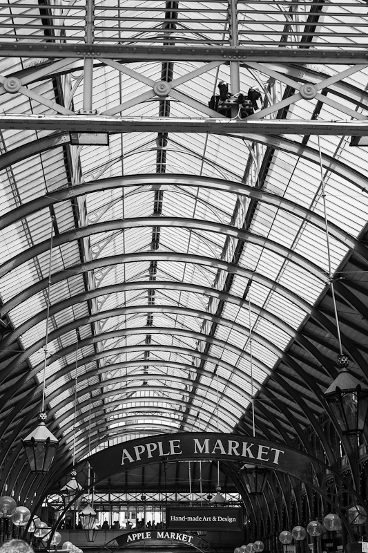
There was one other photograph that appealed as a possible ‘pattern’ and that was taken of the apple market in Covent Garden.  The curves of the roof, and this would make a good contender for ‘curves’ as well come to think of it, has pleasing pattern and I liked the way that the curves of the roof structure are mirrored by the curves of the ‘Apple Market’ signs at the bottom of the image.

Candidate 3 - pattern

Rhythm requires that there is an ‘optical beat’ that draws the eye in a particular direction through an image; there is an obvious parallel with a musical beat here, whereby visual elements of an image dictate the cadence with which the viewer moves through the picture.  I thought that the ‘Boris Bikes’, which are located throughout central London for the use of anyone wishing to risk their credit card in the machine, would proved an excellent example of rhythm, and I set out to find a location and situation where I could both photograph the bikes and have the chance of someone checking out one of the bikes for use.  The first thing I learnt is that these things get little use – at least on the days that I was there – as the racks are mostly full and not many folks decide to risk the roads of Central London!  Fortunately, I did find one willing cyclist taking a chance after spending some time staring at the bikes ..  I’m not sure I currently have a favourite, but will give it some further thought, and maybe print the candidates out and see what I make of it with a side-by-side comparison.  The first one here is a strong contender as I like the person at the end of the row of bikes and also the way he is fortuitously framed against the phone box.
Candidate 1 - rhythm

Candidate 2 - rhythm
Candidate 3 - rhythm

The ‘vertical and horizontal lines’ element is the final set in this post.   This glass office facade has a wealth of vertical and horizontal lines and I really liked the mirroring of the same elements in the reflection in the glass.  It’s a complex image, but it gives the eye plenty to look at and could potentially also be a contender as a ‘pattern’.   A further photograph  featuring vertical and horizontal lines was a glass office frontage in which I spotted the reflection of the Gherkin as an additional level of interest.
Candidate 1 - vertical/horizontal

Candidate 2 - vertical/horizontal

This leaves me with i) two points, ii) several points in a deliberate shape and iii) at least two kinds of implied triangle to work on; I might need one more trip to London as the ‘points’ and ‘triangles’ elements have proved to be quite elusive.  Even though I initially thought that these would be easy to find, it is hard to discover anything interesting that is just a ‘point’ and also to do so without other distracting elements is not always easy.  I do have some potential offerings for these, but we’ll have to see how time goes and whether I can fit in any more shoots.

Saturday, 19 May 2012

Exercise 21 : Elements of Design : Real and Implied Triangles

Triangles are more common than any other design element in photographs.  The simplicity of their three point construction, being the least number of points required to create a polygonal shape of any sort (unless they are in a straight line of course), coupled with the commonly occurring convergent diagonals which are created by camera lenses causing straight lines to converge on a vanishing point, make them a frequent event in images.  They offer dynamic diagonals for energy and also give stability if the base is level with the side or bottom of the frame, with the most stable configuration considered to be with the base level at the bottom of the image.  The converse of this, with the apex at the bottom, is far less stable as a design element and introduces more energy and aggression to an image due to the apparent instability of the virtual structure.

The triangle is such a strong shape that often only two sides are needed before the eye finds and implies the third, sometimes only being represented by the lines of the frame itself.  Even three strong ‘points’ will allow the implication of a triangle without there being the presence of lines at all. These graphic devices are all covered in the exercise here which requires the production of two sets of three images covering real and implied triangles. 

My first image is a very obvious triangle as part of the roof structure of a local building and exemplified the shape in its simplest form.

My second photograph required me to create a triangle by perspective with verticals converging towards the top of the frame.  For this picture I used a picture of a tall building on the Embankment and used a focal length of 24mm, the widest angled lens I possess to create the converging verticals which created the triangle.  A flat white sky did little for this picture, but at least the triangular device was clear!


An inverted triangle, with lines converging by perspective was created by the supporting structure underneath the Millennium Bridge in London.  There are actually two triangles here, one created by the dark metal and one by the light metal, but both with an apparent convergence towards the bottom of the frame.


Where groups of objects are of a different size but need to be combined in one image (such as in product photography perhaps), it is possible to put the smallest object at the apex (i.e. nearer the camera) and the larger objects behind to gain a greater equivalence in the apparent size of the objects.  For this exercise I selected a series of items left from Christmas festivities and used a wide angled lens (24mm) to shoot the image from directly above for the ‘base at the bottom’ image, we’ll call it ‘Christmas Leftovers” ..

The second still life image needed to be an inverted triangle with the apex at the bottom.  For this image I rearranged the items from “Christmas Leftovers” and took two approaches.  The first had a large object, the paper hat, at the apex of the triangle and the two smallest items, the party popper and the water pistol, at the top.  This felt quite a table configuration, presumably because of the large item at the base conferring apparent stability to the arrangement.

For the second set up I looked at, the water pistol was moved to the apex at the bottom of the triangle as I was trying to make the arrangement look more unstable, and this was aided by moving the wine glass and spilled content to point towards the base as if the instability had caused it to fall;  I kept the wine glass at a diagonal to hopefully add more energy to an unstable image.

The final element in the exercise was to arrange three people so that either their faces or their bodies formed the apices of a triangle.  I remembered taking this shot a few months ago on a sunny morning after snow, and the position of the people was (fortuitously) an excellent triangle; the glowing happy faces are particularly accentuated by the sun and stand out in a triangular element.


Shapes are vital elements of design as they organise an image and impose structure to give coherence to a picture.  Triangular elements in an image can be strengthened and emphasised by any photographic device which removes distracting lines and structures from the photograph.  Reportage photography usually demands simplicity and clarity to make the intent of an image obvious, and the triangle is a classic way of achieving this objective and delivering some order from the chaos which is often not under the control of the photographer.
Rectangles are generally man made and are rather a dull graphic device in my view, usually associated with borders round things (like photographs ...) and are rather final and restrictive.  They appear frequently, and obviously, in architectural photography where they are an essential element of structure and composition, but are largely static and lacking in dynamism.
Circles as design elements are damn difficult to find unless they are actually real circular objects themselves.  They are considered, at least by Michael Freeman in the OCA course notes, to be the most structurally powerful of all graphic devices because of their enclosing properties.  Freeman (2007) also asserts that circles can be associated with movement because of the link with rotational direction, although I would think this would be suggested more strongly by an actual circular object rather than by an implied circle.
This exercise seemed relatively straightforward on the face of it, but producing implied triangles from the two still life photographs I set up was anything but.  Apart from the earlier exercise where I used the silver discs to build up the pattern one piece at a time (Exercise 16 – Multiple Points), this was the first time I had ever attempted to set up any form of still life in my life.  It’s not a photographic genre that I feel any great affinity for, much preferring to make an image from a found situation, but I suspect that I am going to have to develop at least some skills in the area as the course progresses.  Unfortunately, it’s not something that I enjoy as the results are largely predictable, although clearly the actual quality of the outcome depends on photographic, lighting and artistic skills.

Saturday, 12 May 2012

Exercise 22 : Elements of Design : Rhythms and patterns

The first opportunity to combine multiple design elements arises in this exercise on rhythms and patterns in images; the key word here is repetition.  Visual repetition manifests itself as either rhythm or pattern and is claimed to have particular appeal when the repetition is of objects unfamiliar to the viewer (Freeman, 2007).

The fundamental differences between them is that rhythm is associated with the movement of the eye across the picture (dynamic repetition), whereas pattern is static and is more linked to an area (static repetition).  Many published examples of rhythms ask the eye to follow the rhythmical progression from left to right (should be easy enough .. I wonder what the Chinese make of this ..) and establish a cadence of rhythmical beat.  Any form of anomaly that disturbs the rhythmical progression across the image can make the picture more interesting, especially if the interruption to the rhythm occurs to the right of the photograph after the eye has established its visual beat.  Coming back to our old friend the Gestalt Law of Good Continuation again, and we can perhaps understand that the eye will extend its perception of the rhythm of an image beyond the borders imposed by the frame.
Patterns on the other hand, are static, and have their greatest impact when they fill the frame and convince the viewer that they extend beyond it.  Although still founded on repetition, this repetition is linked with an area and not a direction as occurs with rhythms. 

I considered a number of options for this exercise, which required the production of just one photograph to illustrate each element.  For pattern, I looked at some of the close ups from my visit to the RHS Gardens at Wisley, and especially liked this cactus as a representation of a pattern with its different sized, but very similar elements.  There was also one other image from the London series which addressed ‘pattern’ very well – a series of windows which also fulfilled the criteria of extending beyond the edge of the frame and giving the impression of continuation.  Oddly similar in colour and tone to the cacti too!


For rhythm, I selected one image from a series of photographs I took in London of the so called ‘Boris bikes’ which are available for public use for a credit card payment.  I considered a number of angles for taking pictures of these bikes and also experimented with different focal lengths to test the impact of changing the depth of field on the visual impression of the row.   I finally settled on this image which I took at 35mm and f/8 to encompass the whole row but allow the furthest bikes to fade out of focus.  I think the figure at the end of the row adds a little to the photograph, but it is not as dominant a discontinuity as I had hoped for.

I enjoyed this exercise from the point of view that it provided a different challenge from seeking out basic shapes, and it was easy to find examples of patterns and rhythms, at least with architectural themes anyway.  I was not successful in finding rhythms that contained a significant discontinuity to break the flow and for the eye to ‘find’ as it scanned across the image and I intend to continue to look for suitable pictures as I seek out further material for Elements of Design.

Wednesday, 9 May 2012

Exercise 20 : Elements of Design : Implied lines


First of all, in case anyone has a laugh at the directional arrows on my first implied lines exercise, you try doing it with one finger on a laptop mouse pad!!  I could repeat it at home on the Wacom or with the Photoshop pen tool, but then this is art ... !

The human eye will follow a line and the brain will imagine a line by following a row of disconnected points or other visually leading devices, and imply its own line structure.   Strong and continuous diagonals and curves draw the eye more powerfully than the subtlety of implied lines, but we require remarkably little for the brain to fill in the gaps between points or to follow the line suggested by the direction in which the eyes of people in photographs are looking or their heads are turned.  Movement implied in photographs also causes the eye to look ahead of a moving object, and the use of slower shutter speeds to show movement and imply a direction of travel is a well accepted graphical design element.  Implied lines can also be derived from rows of points or extensions of existing lines where these suggest continuation in a particular direction.

Humans have a very strong imperative to look at other human faces and are drawn to these when they view photographs as well as in reality, and it is natural therefore that we will follow the gaze of people in life as well as in photographs.  I have blogged about the Gestalt Laws of Perception in the past (blog post on Exercise 16), and this characteristic of human behaviour is an example of the Gestalt Law of Good Continuation in action.  What are people looking at and why leads us on to other elements of a photograph.

The exercise firstly required me to look at the pair of photographs provided in the OCA course notes.  Both of these are readily available online by searching Google Images, from where they can be downloaded for the addition of directional arrows as is required by the exercise.  The first image I looked at was ‘Threshing corn in Sicily’ by Gotthard Schuh and shows two horses running counter-clockwise around the farmer.  There is a clear implied line of directional travel of both the horses as they gallop and I have shown these with red arrows.  The farmer looks to be stepping forwards as he works and again I have used the red arrow to define the implied line along which he is moving.  I also saw some very strong eye lines in this images, firstly from both the horses as they look in their direction of movement, and secondly from the farmer as he looks forward,  presumably to the corn.  If I was to pick the most significant of all the lines in the image I would say that the eye line of the closest horse dominates the photograph, probably because it is the largest and closest element of the image, and also perhaps because this horse is well above the line of the horizon which adds to its prominence.


The second image comes from Michael Freeman himself and shows a torero executing a pass with the pink and gold capote, or cape (the red cape comes later in this barbaric spectacle).   In the photography the movement and direction of the bull can be seen in from the dust which has risen from the hooves as the animal charged, so I see a clear directional line implied by the movement of the bull (red arrow).  The capote is swept from in front of the bull with the right hand and away from it with the left hand as the pass is executed.  Therefore I have marked two more directional lines in red.  The eye line of the torero is distinctly down at the bull, and is marked with a blue arrow.


The second part of the exercise asks that I take three of my own photographs and perform the same analysis.  For my first, I have taken an image from my visit to the RHS gardens at Wisley (see blog post on Exercise 19) of someone looking at a booklet.  There is a very clear implied eye line as she looks at what she is reading and the eye line is marked with a blue arrow.


My second image shows the West Country class steam locomotive ‘Wadebridge’ approaching Ropley Station on the preserved Watercress Line in Hampshire.  The steam flowing behind the engine clearly suggests forward movement and direction of travel, and again the direction of movement implied is indicated by the blue arrow.


My third photograph shows a boat on the River Thames in London.  The wash at the bow, the direction of the flag on the bow and the sharper construction of the bow itself imply forward movement, shown here with red arrows for contrast.


The final part of this exercise asks that two further photographs are taken, one to suggest an eye line and one to show the extension of a line or lines that point.  I thought about eye lines and decided to look for an image with single and clear lines and another where there was interaction between individuals and multiple eye lines.  The first is simply a picture of two people looking at a sign board in a garden where the eye line of both are clear and unambiguous.  The second (actually taken a shutter speed of 1/15sec through a waterfall) shows multiple eye lines (arrows in blue) which themselves seem to form a series of linked points and form their own implied line moving from the woman on the left, to the adult and child and to the woman in red and then in the direction of her gaze.  In a way, this almost addressed the brief for both photographs in a single image, although I did produce one more image to exemplify lines that point.


This final image shows two very dominant lines in terms of the grass and lake borders which point strongly to the building at the end of the lake and lead the eye there.  Indeed, the plant pots could also be construed to form a line of points which lead the viewer in the same direction.


This exercise revealed some unexpected themes around people and eye lines.  On the face of it, where a human subject is looking in a photograph is a simple enough concept in terms of understanding the implied line, but there are complex interactions between people in different situations which can complicate things and give rise to other lines – I found this in my waterfall picture in this exercise – there’s even an implied triangle in there as well.