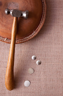
The basis of
this exercise is that with multiple points the relationships between them is
less predictable compared with single points and that the relationship should
be “active rather than obvious and static”.
I considered
a number of options for this, initially around natural subjects like sea shells
and pebbles, but I eventually settled on a simple piece of hessian for the
background and some of the tools of the silversmithing trade which are readily
accessible to me. I chose a ‘sandbag’
(basically a circular leather cushion with a concavity in the top) which is
used for hammering dish shapes and a domed hammer to establish a ‘frame’ in
which to set my items. These were a
range of different sized silver discs, some polished and some textured, which
are used to eventually assemble a range of jewellery pieces. I made four attempts to build up the image in
various ways, using horizontal or vertical framing, and trying to establish an
interesting pattern. I felt that the
vertical framing fitted the image best, I think because of the long handle of
the hammer running down the left hand side.My favoured two sets of images are shown below. One thing I did find beneficial was flicking rapidly through the sequences if images on the back of the camera and seeing each new piece added – it somehow made it easier to make sense of the elements of the design as they built up. The final arrangement of the nine pieces of silver in Set 1 appeared to me to have two distinct lines of flow moving through it, and these are sketched on the subsidiary image alongside the original. In Set 2 I started at the bottom of the handle of the hammer with one of the larger discs, and as I built up the elements of the image I noticed that I was in some way copying the shape of the wooden handle as I progressed. I didn’t feel that this set had the same flow to the lines as the original, it was altogether more obvious, although I did like the way it followed the shape of the handle.
The final image is simply for interest and shows a typical piece of silver jewellery that the discs would eventually be assembled into. For more information see this link.
Freeman (2007) points out that the eye has a great tendency to try and create shapes from an arrangement of objects, the so called Gestalt perception. The basic tenet of Gestalt perception is that the brain will move from seeing the individual elements of a scene to understanding the overall meaning of the scene. ‘Gestalt’ refers to the way in which an image is assembled and is therefore a critical component of the understanding of composition and how an image is perceived. Gestalt implies that insight is applied in the comprehension of an image, rather than following an iterative and mechanistic approach, and that the ultimate understanding of a picture should be a simple and unconscious process. Gestalt organisation is said to explain the ways in which graphic elements in an image (such as those considered in Elements of Design .. points, lines, triangles etc.) are completed in the mind and can be regrouped and restructured to make sense of the entire image. I’ll get more into Gestalt Perception at a later stage, and as a reminder I have included the Gestalt Laws of Perceptual Organisation into my hard copy Learning Journal. One of the best series of examples and a simple explanation of Gestaltism can be found here.
Images for Set 1
Images for Set 2


No comments:
Post a Comment