I have spent
a number of sessions playing with lights and loaves and experimenting with
flash, grids, snoots, gobos, flags, small and large constant lights, candle
light and natural light outside as well as various reflectors and
diffusers. I have had a great time
exploring this as it is not an area of photography where I have any previous significant
experience and the learning curve has been steep and profitable. In the end I felt quite comfortable that I
could set up lights and modifiers to get the effects I wanted, especially using
the constant lights, and it soon became clear that the larger lights were a far
better option, and with 1300 watts burning away, things were just that much
easier to set up. I thought the loaf was
ultimately a good choice as it had such pronounced shape and texture with it
block shape and fine irregularities on the surface. I also tried as I went along to add a few
more aspects to the shots, so introduced some simple props that I thought
fitted the situation, like the wine in the candlelit shot and the knife in the
shot where I eventually chopped the loaf in half (it was almost fossilised by
then).
Shape
The technical
details of these images are described in a previous log post, so this is all
about the selected images I intend to put forward for assessment. The first ‘shape’ shot was taken indoors and the lighting was set up such that
he loaf was almost in silhouette and the background was well lit to provide a
contrast with the darkness of the bread.
I felt that this worked very well as only the outline of the loaf was
clearly defined, yet the identity of the subject was clear. The second shot for ‘shape’ was taken outdoors and I wanted to try and use a rim light
effect in this case such that I could show the dark loaf against a dark
background – obviously only possible if the edges were picked out by the
light. A low sun and some precise deployment
of gobos and flags got the effect I was after, very much aided by the shiny and
baked top of the loaf catching the rays of the sun.
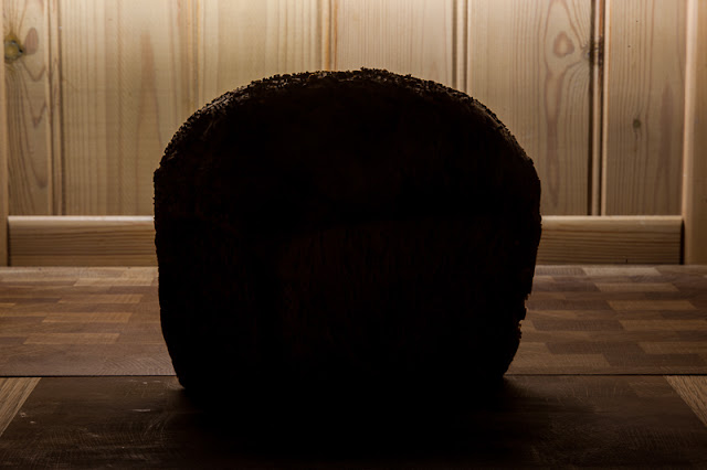 |
| Shape (artificial light) |
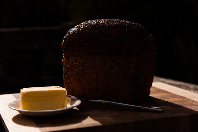 |
| Shape (natural light) |
Form
‘Form’ is all about the volume or 3D
aspect of a subject and I felt needed a higher camera angle and a single light left
and level, with a reflector deployed front and right to add different degrees
of fill until I felt I had achieved the effect I was after without knocking out
the shadow detail under the loaf. I shot
an alternative to this as I thought the loaf stood on its end might be better
to demonstrate the 3D effect I was after.
This was again lit from the side and left with the reflector front and
right used to adjust the shadow so it was not too dark, but without taking out
the shadow that created the effect of volume.
Although both do the job, I think the upright shot of the loaf is better
as it uses three of the flat sides and accentuated the 3D effect.
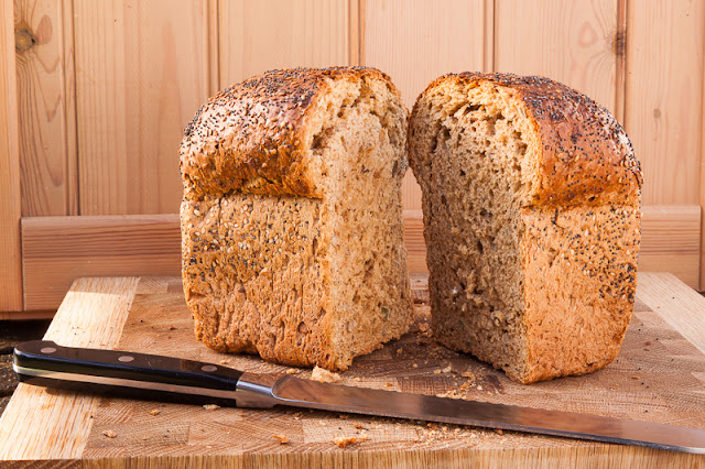
The last shot
for ‘form’ took a different approach
and in this instance I cut the loaf in half and used a reflector to put light
onto the left hand half and used the reflection from the knife to just lift the
shadow on the right hand half (I was surprised this worked as well as it did,
but the knife does have quite a large silver and shiny surface area.
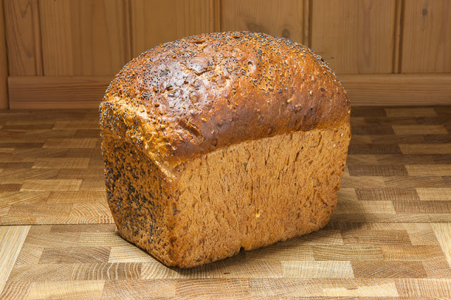 |
| Rejected : Form (artificial light) |
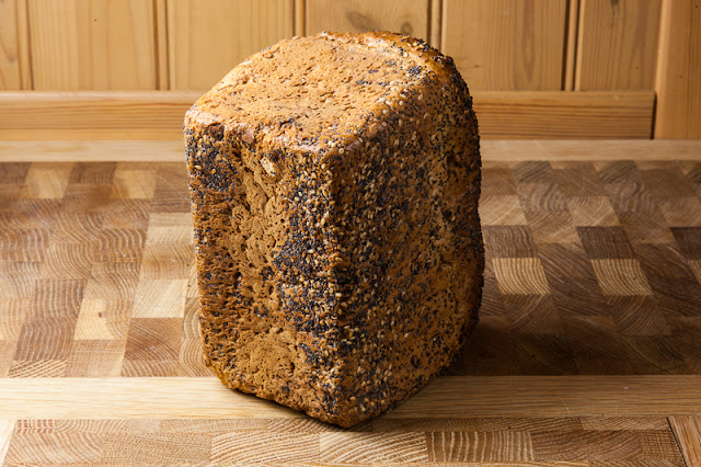 |
| Selected : Form (artificial light) |
 |
| Form (natural light) |
Texture
I agonised
over the selection of the final image here for some considerable time. I decided early on that the shot with the
flash and the snoot plus flag that I took with the 70-200mm lens at a focal
length of 200mm was the one I wanted to go with, but what sort of crop was most
appropriate? Given that I wanted to
accentuate detail in the image I eventually decided to go with the crop that
showed the most detailed part of the photograph where the small and hard
shadows were at their most acute and there was no distraction of background or
surroundings. I chose the second shot
from the outdoor series where I had set up a series of gobos and flags to
restrict access of light to the loaf in quite an extreme manner, with just a
slice of the low and harsh sunlight raking across the face of the loaf. Given the cloudless sky, the sun represented
a small and hard light source and the angle the bread was presented to the
light really pulled out the sharp detail on the top and front.
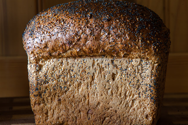 |
| Rejected : Texture (artificial light) |
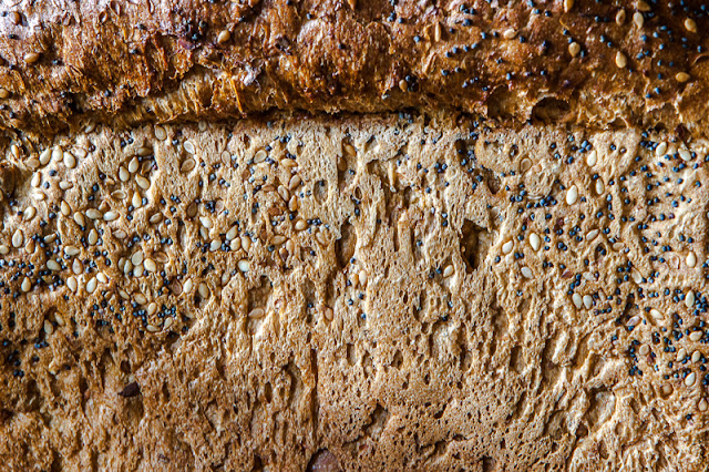 |
| Selected : Texture (artificial light) |
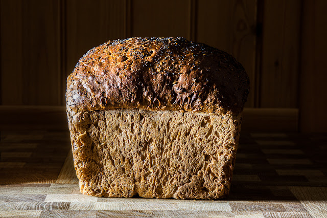 |
| Texture (natural light) |
Colour
I wanted to
do this without recourse to Photoshop, so chose to go with the photographs
taken indoors in candle light and outdoors in the sun. The candle light shot was lit entirely with
six candles and required an exposure of 90 seconds, but it did deliver a richly
coloured image which brought out the warmth in the scene. The outdoor shot was
taken quite early in the day when there is more orange in the light and again
the choice of light source and direction brought colour and warmth to the loaf.
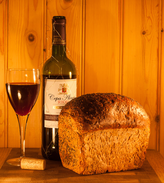 |
| Colour (artificial light) |
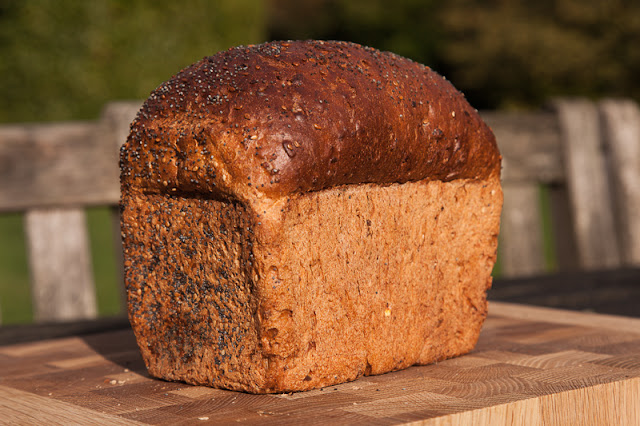 |
| Colour (natural light) |
So, that’s
the end of Light and Assessment 4, at
least until I get tutor feedback anyway.
I learnt more from this unit and building towards the assessment images
than I did from any other part of the course so far. I had done very little indoor work at all until
this point and the topics explored were new to me as I explained in the introduction
to this piece. Some things were
frustrating, especially the demonstration of form, which I originally felt
should have been the easiest to demonstrate.
With the loaf as the subject of the assessment, it had such an obvious
3D structure that regardless of how it was shot I always felt it showed ‘form’ whenever it was photographed in full
light.
‘Texture’ and ‘Shape’ were the most satisfying elements for me as it was possible
to create such massive changes in the way the subject was lit with relatively
small and subtle changes in the positions and angles of the various light
modifiers. I got a lot out of this and
it is certainly an aspect of lighting that I plan to use more in my other
photography rather than just being satisfied by subjects that were ‘nicely’
lit. Light,
Science and Magic was a great companion text to Light, as was Syl Arena’s Speedliter’s
Handbook, both for the lighting setup diagrams and for the Canon specific
guidance when using flash. Other sources
worthy of note are the Strobist blog and the lightingmods blog as well.
I have written a
separate post about this, but I attended a two day Royal Photographic
Society workshop on studio lighting which was tutored by Chris Burfoot. This was an outstanding couple of days and
all the concepts that I have working on during the Light module were covered, but with respect to studio photography. Oh how wonderful it would be to have the huge
Broncolor studio flashes and a Hasselblad medium format camera to use like we
did on the course …. rather over the top
for a loaf of bread I guess …


No comments:
Post a Comment